Barbaros Smokehouse Bbq, is the first smokehouse in Valencia,Spain. Behind the restaurant, we have three partners, who love smoked and grilled meat and decided to be pioneers as the first smokehouse here in Valencia. They take care of the quality of the food to the smallest detail, this is reflected in the smoking technique that they use, which takes 12-14 hours.
There is a gap between the experience of going onto their website, and the experience at the restaurant or on their social media which both have top quality. There is no correlation between these two phases of the user experience, because their website lacks of brand identity and does not reflect the high level of professionalism, quality and service that is experienced at the restaurant and on their social media.
Constraints
Due to the lack of budget for pre-launch testing, the MVP could not be validated with users prior to production.
Scope limited to a single design phase.
Given that stakeholders were non-technical, the solutions had to be intuitive and operable without technical expertise.
WordPress implementation imposed constraints through templates, plugins, other limitations that comes with building the website on this platform, and restricted CSS customization.
The reservation system was standardized and only partially customizable.
Prioritization Framework: Impact vs. Effort
02.Research & Empathize
Hypothesis
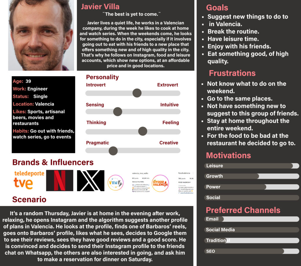
A low loyalty and slow increase in reservations, because the website does not reflect the level of quality that is reflected on their social media and the experience at the restaurant. In the interviews what I seek is to evidence their booking process, what they connect with the design of the website of a restaurant, what they look for when booking online and what are their channels of contact with the restaurant.
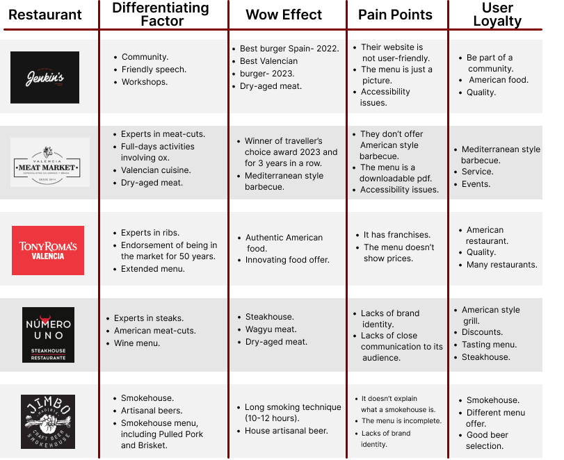
Benchmarking
Research Approach
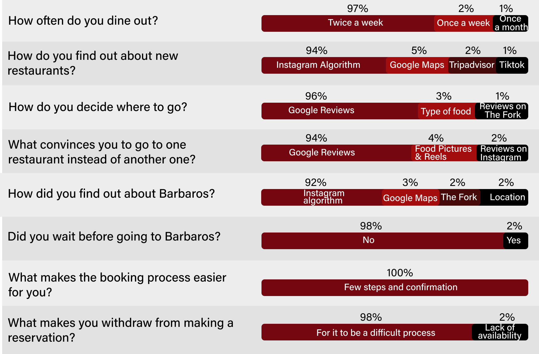
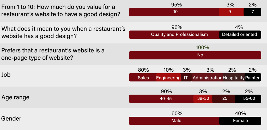
In order to understand in-depth what happens at the restaurant, I first met with the stakeholders and workers of the restaurant, then I conducted a series of interviews with both new and recurring customers, in total 15 customers were interviewed, 60% of them being men and 40% women, between the ages: 30-60.
Research Results
Insights
These are the most significant points that have been discovered during the research phase. These points should be taken into account in the structuring and design of the website.
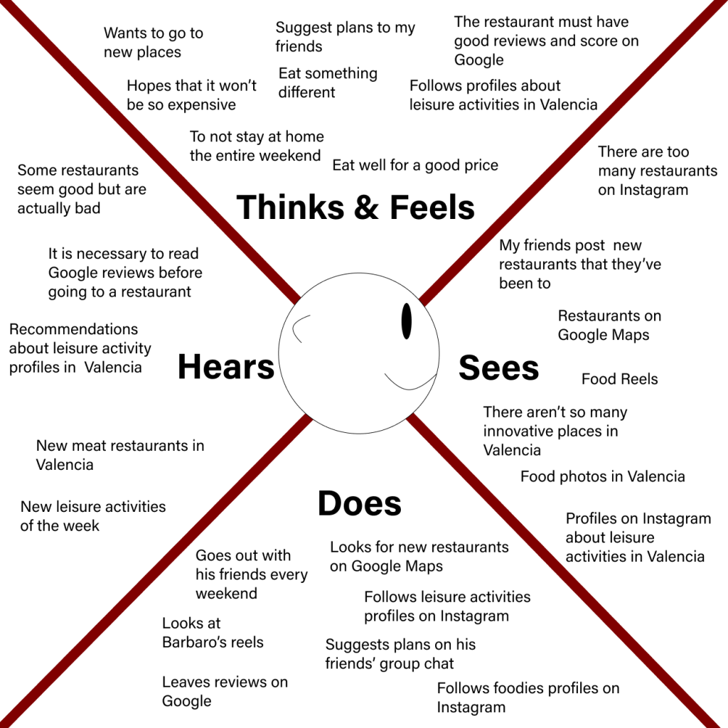
Empathy Map
In this phase, I conducted an in-depth exercise to fully understand and empathize with users' behaviors, needs, and desires.
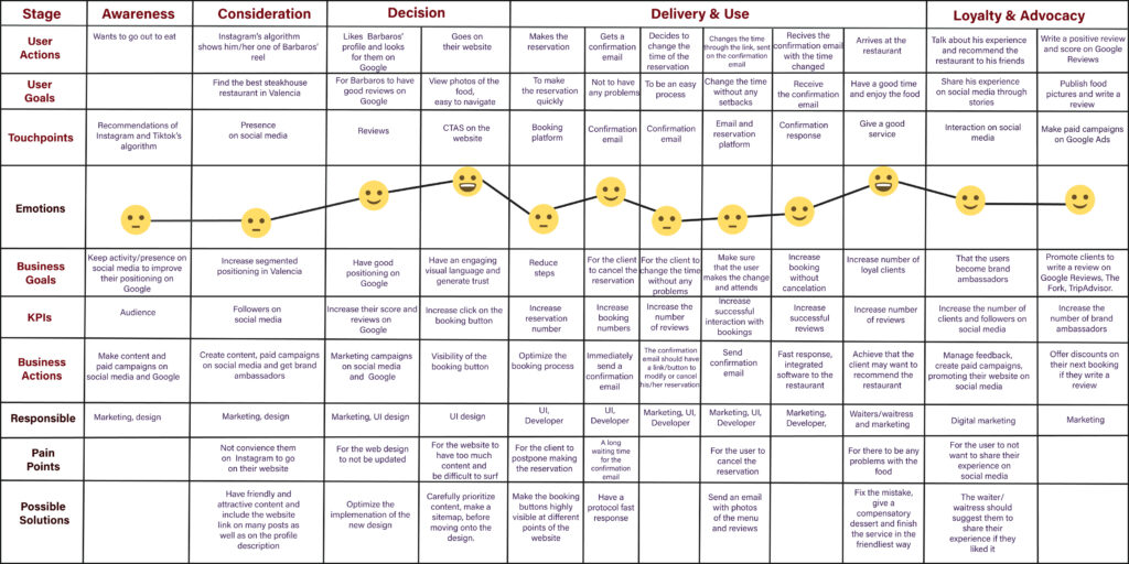
This is the customer journey before, during, and after using the website. This helps us identify pain points to alleviate them and make the design more efficient by anticipating user needs and ensuring a user-centered experience.
Solution
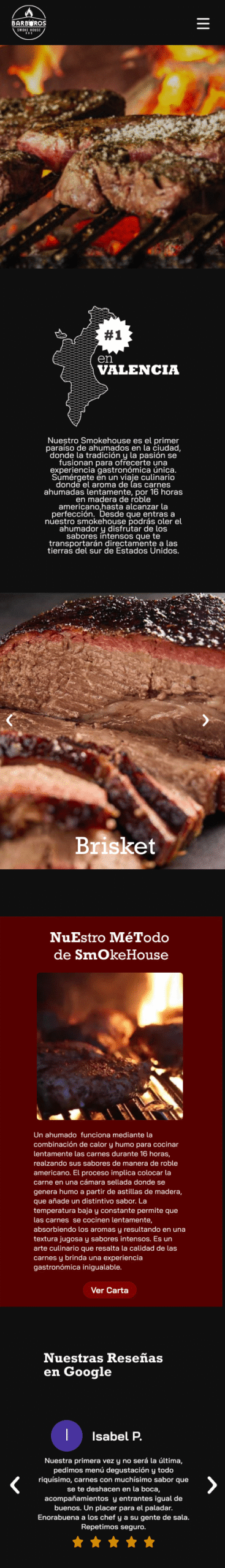
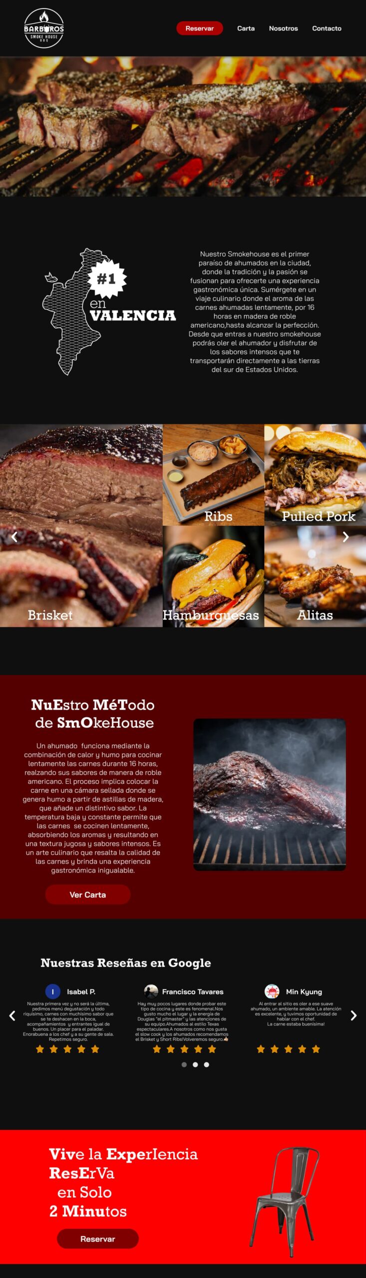
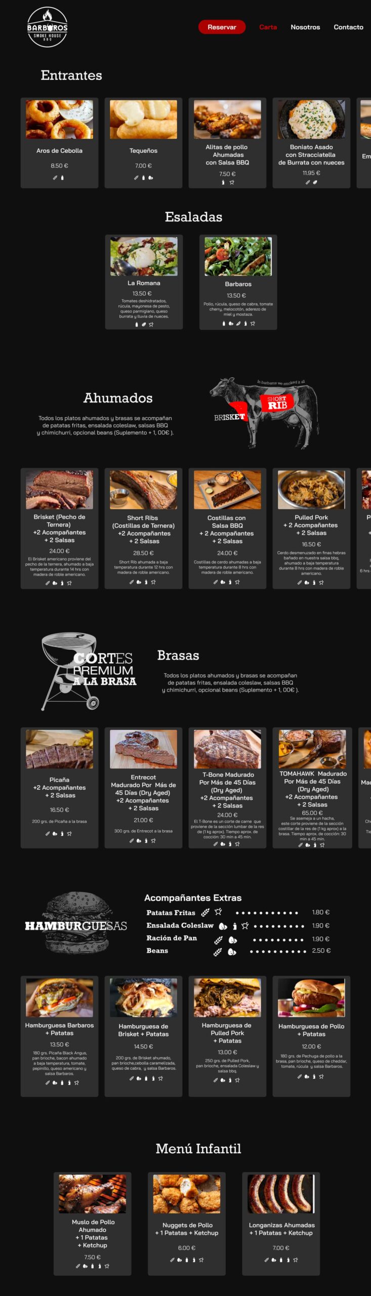
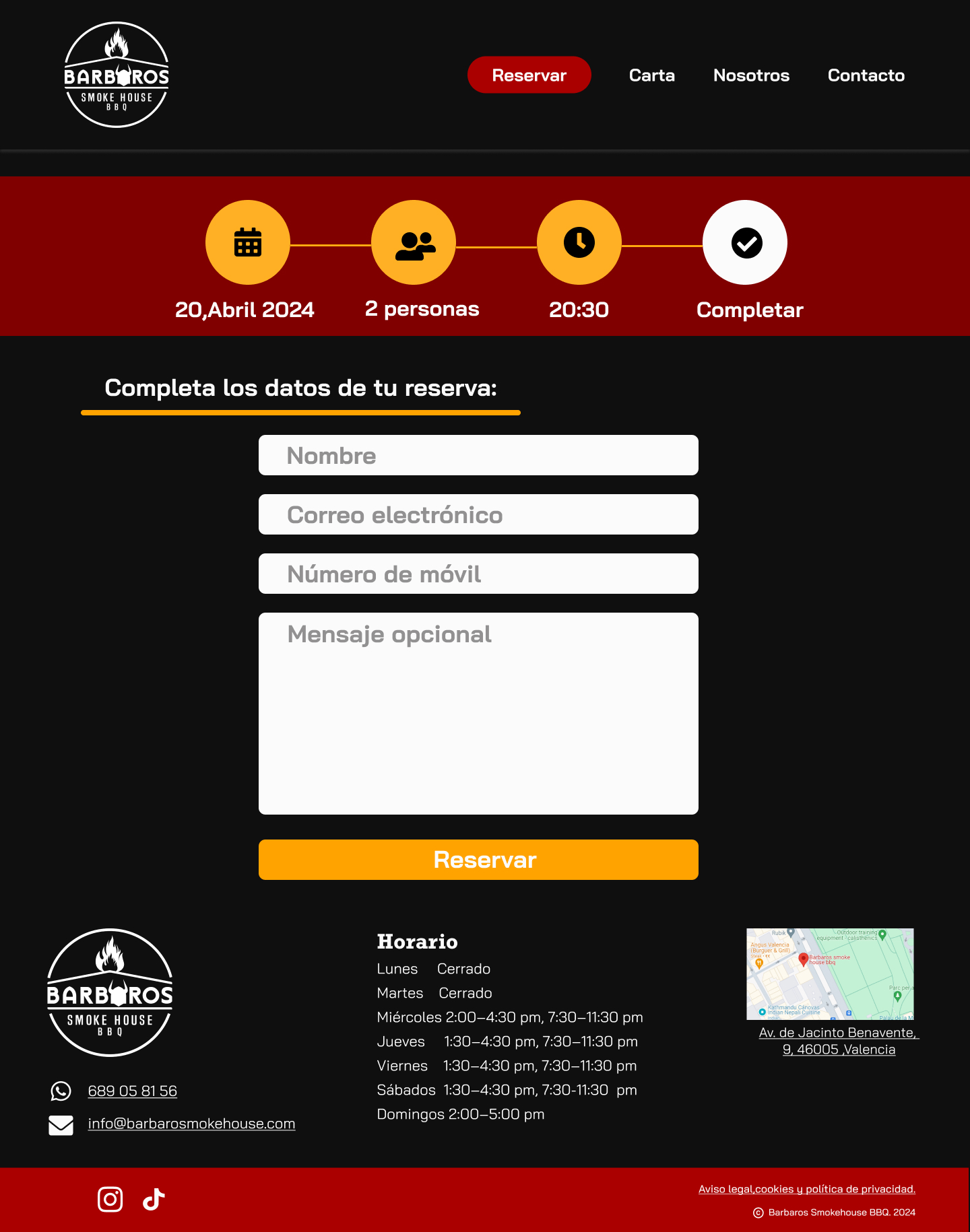
Redesign their current website, and design a website that reflects the level of their food quality, service and identity of the restaurant being the first smokehouse in Valencia. Give a 360° degree experience from start to end, this will allow them to build loyalty quicker to their users and at the same time provide the same experience to users: from the first contact they make with the brand on social media, to when they go on the website to see the menu and make a reservation, to finally have the full experience at the restaurant.
04.Ideate
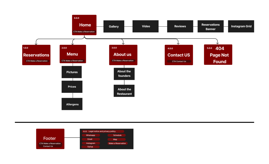
Sitemap
Here, we define the information architecture, strategically placing CTAs (Calls to Action) and organizing the website content to optimize Google ranking and the workflow during both the design and development processes.
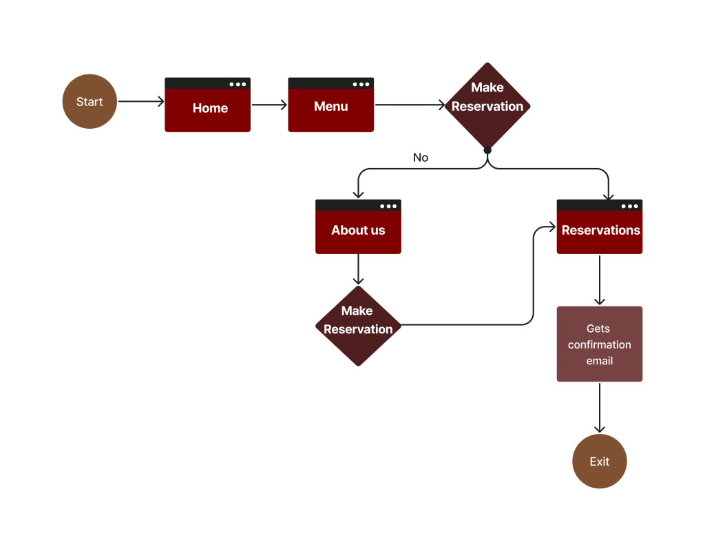
User Flow
This is the sequence of actions that users take within the website. Mapping these actions is essential for optimizing interactions and navigation, making the website more user-friendly and increasing conversion rates by strategically positioning CTAs.
05.Prototype
Wireframe
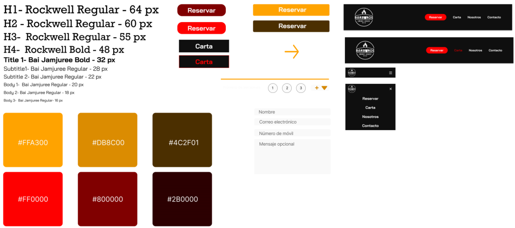
UI Kit
Look & Feel
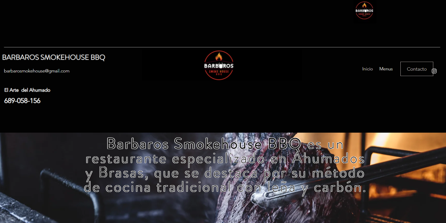
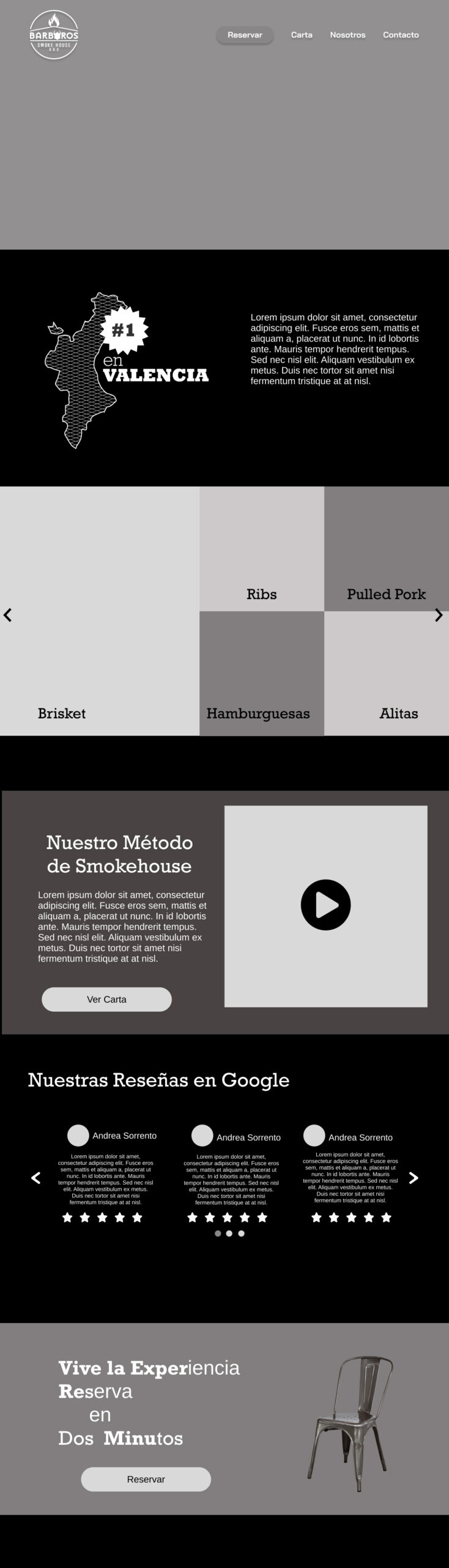
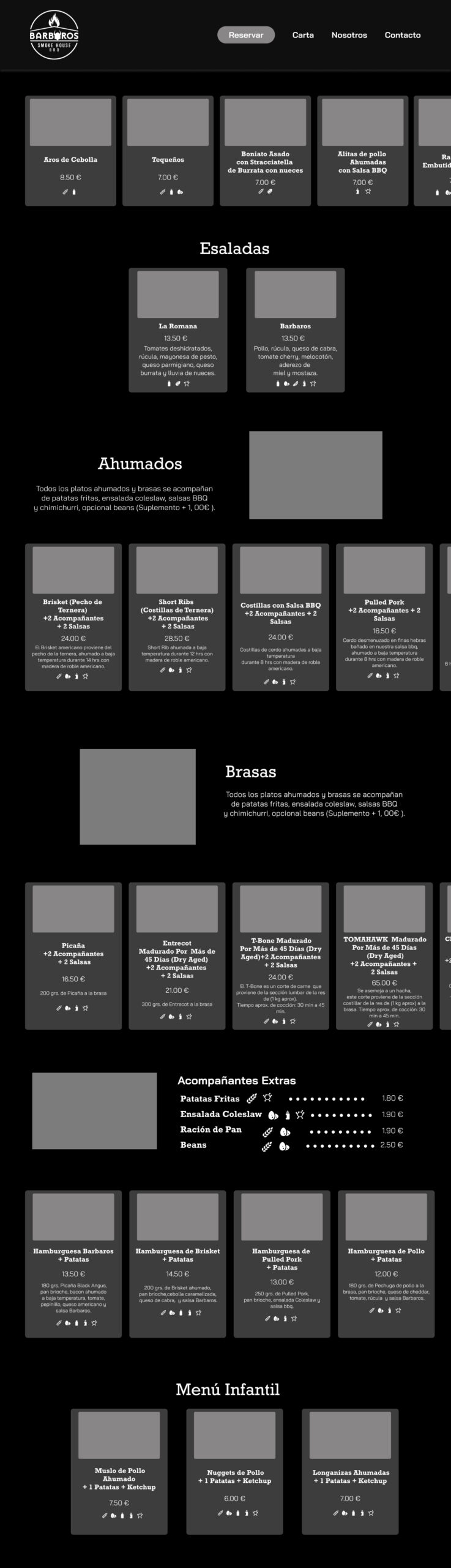
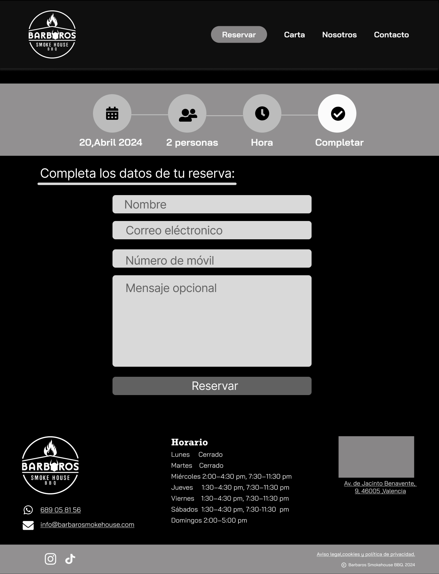
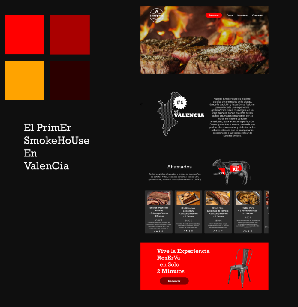
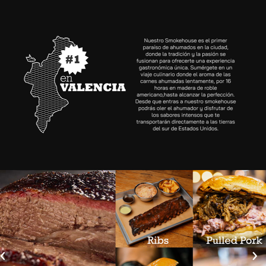
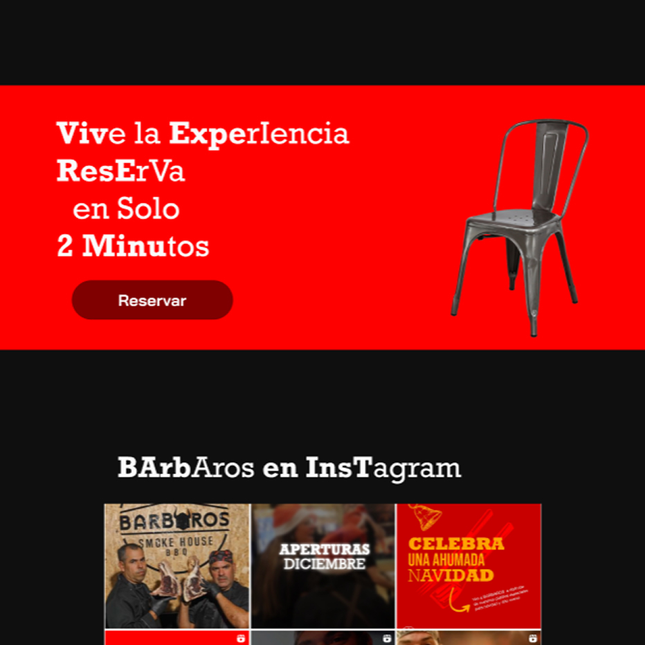
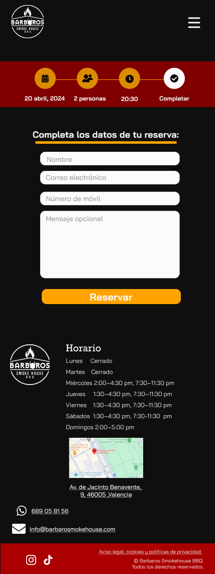
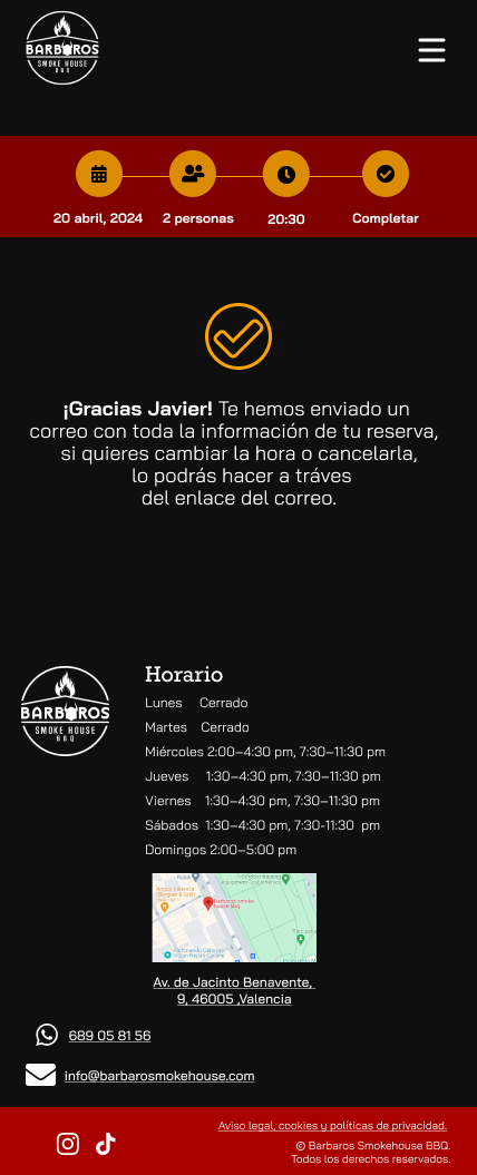
Mobile UI
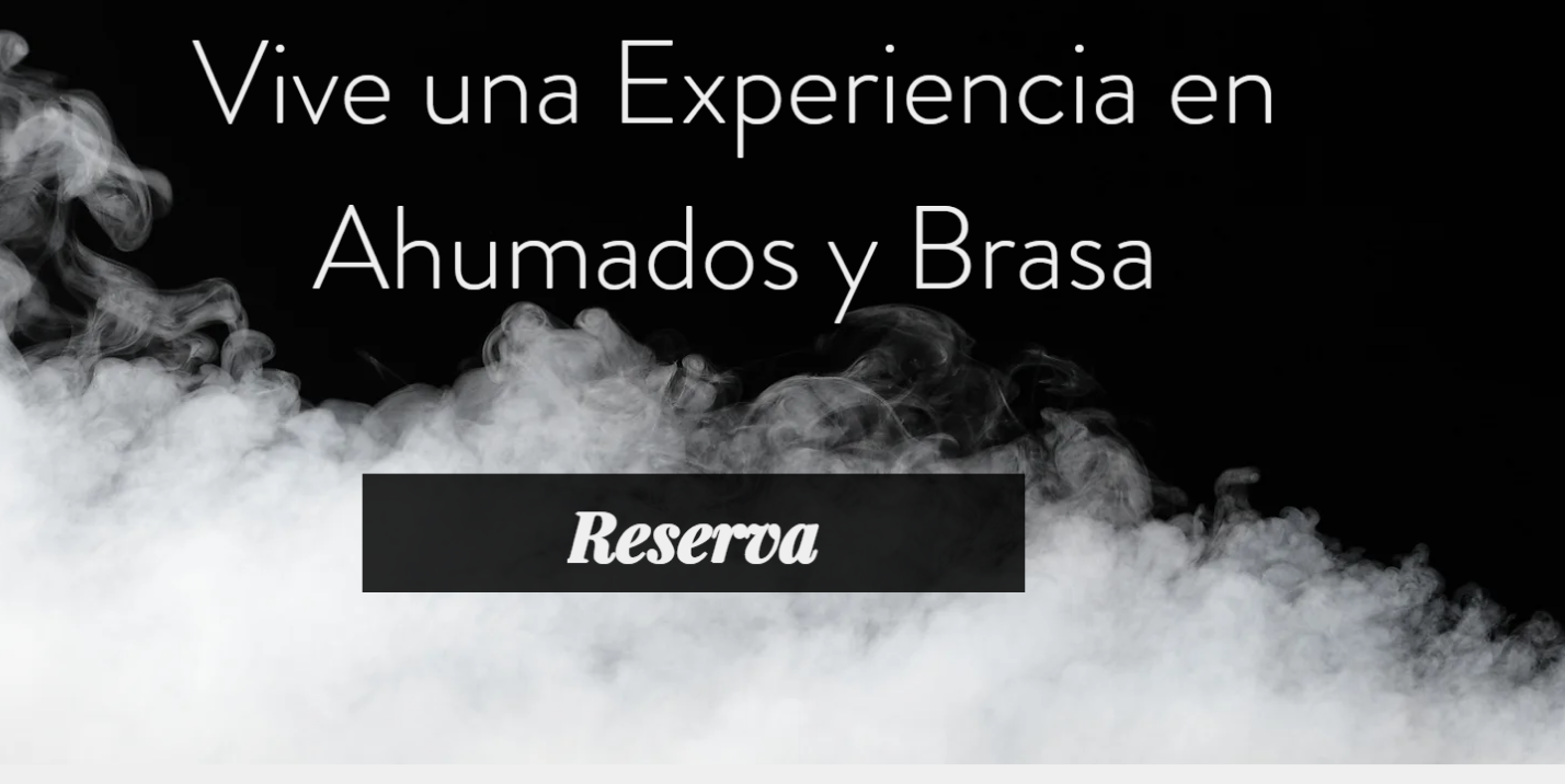
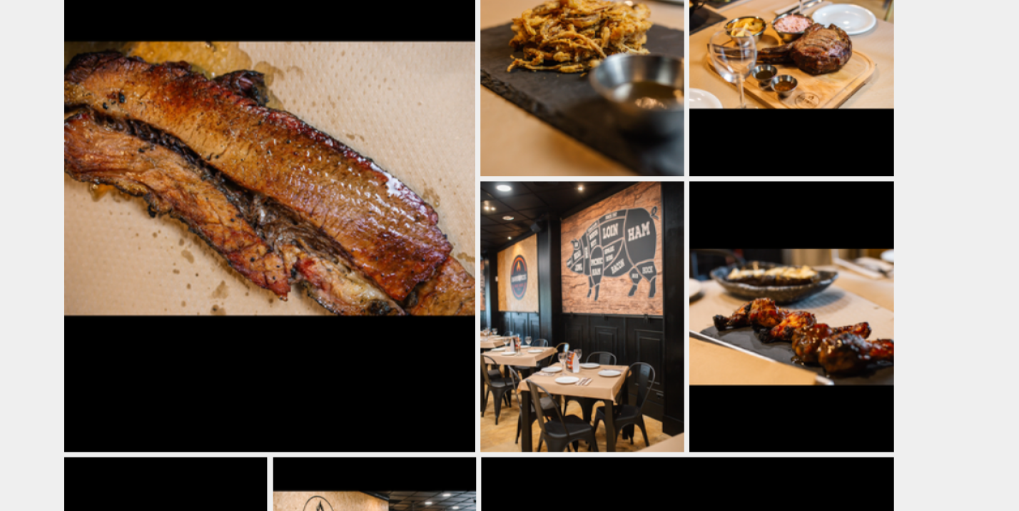
Desktop UI
06.Delivery
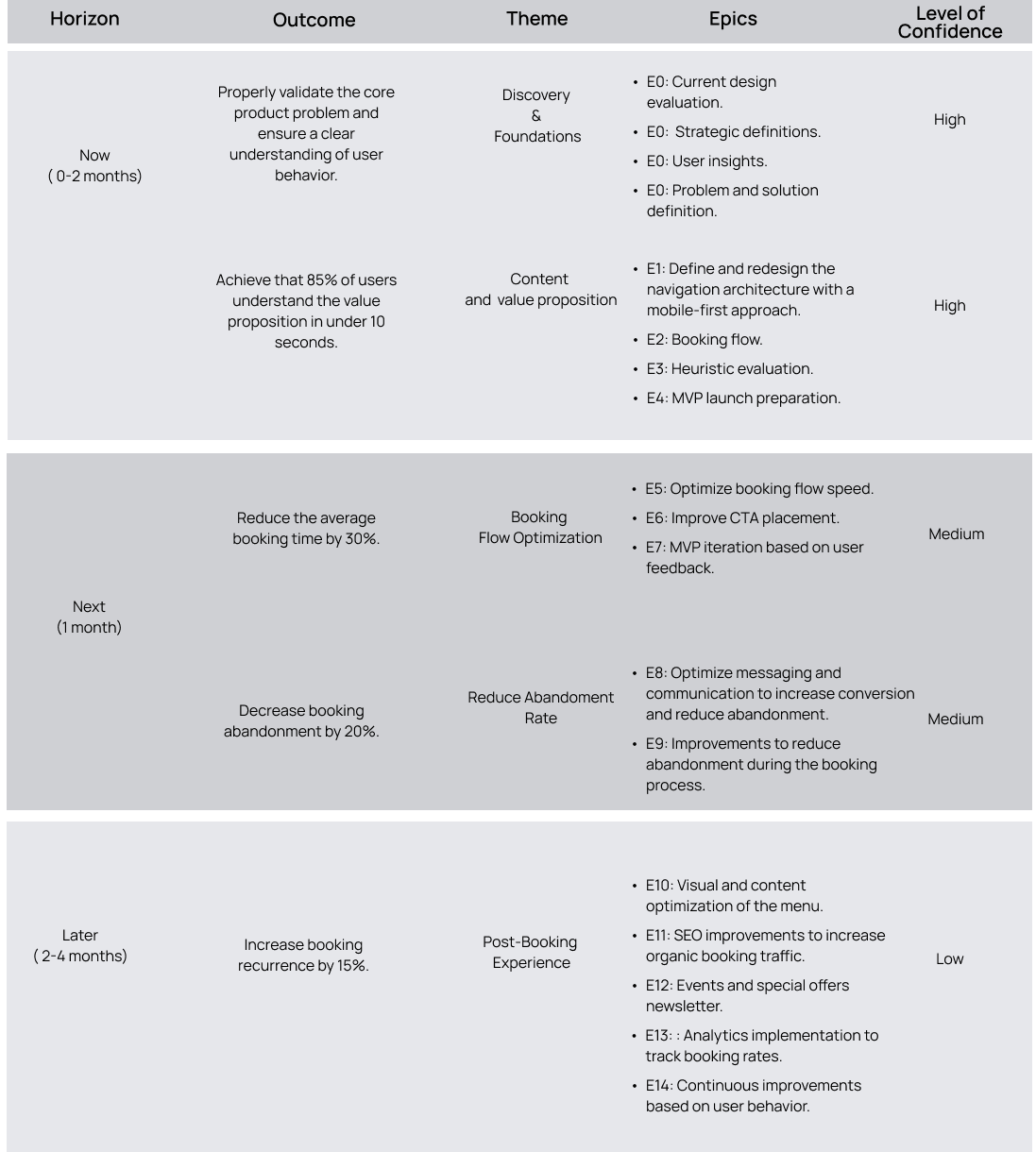
Roadmap
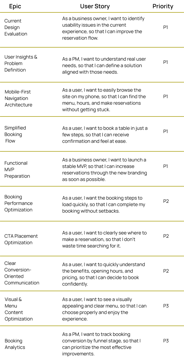
High-Level Backlog
This backlog represents a strategic view of the product. Execution was carried out in iterative sprints of 1 to 2 weeks.
Acceptance Criteria
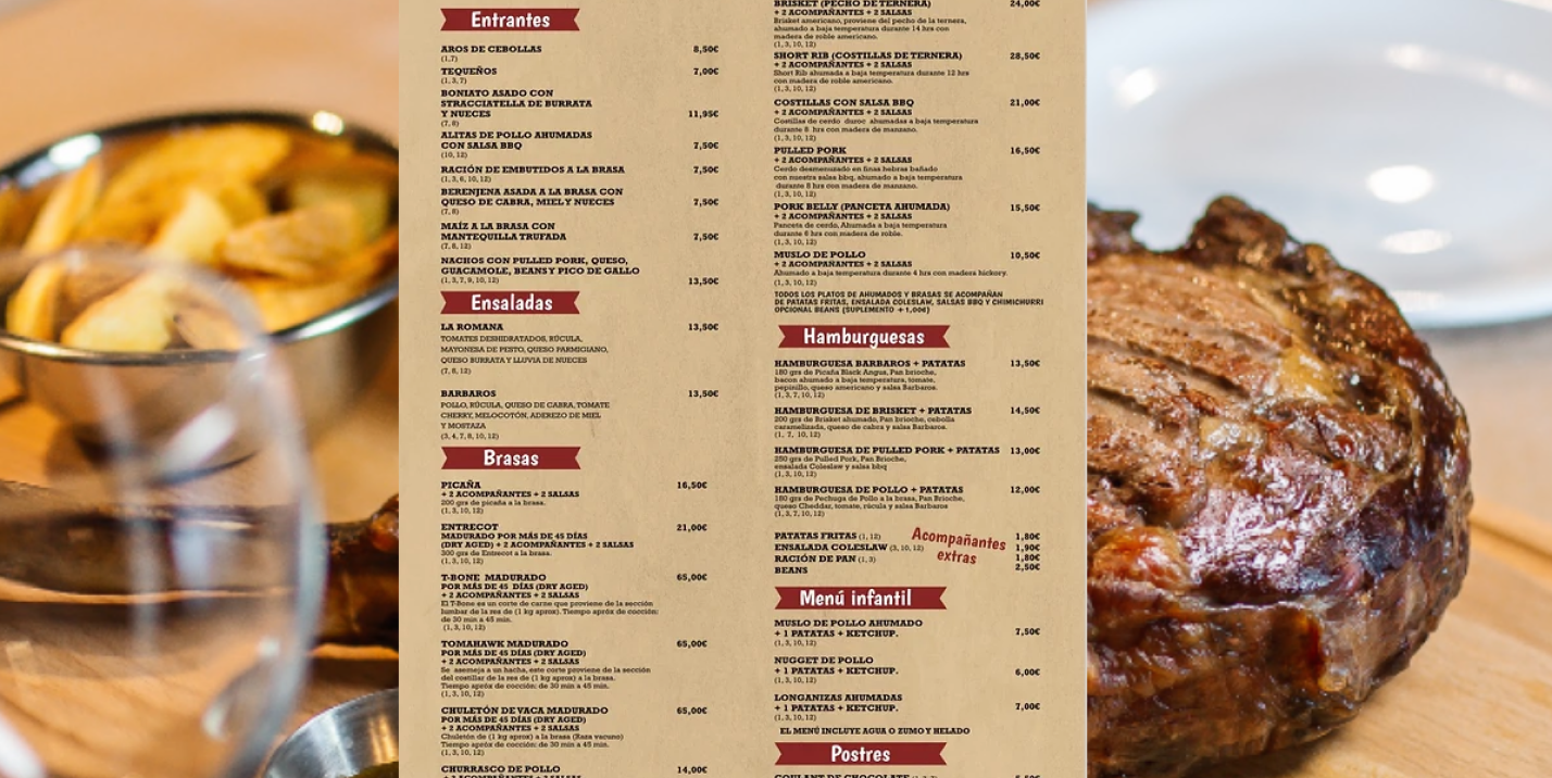
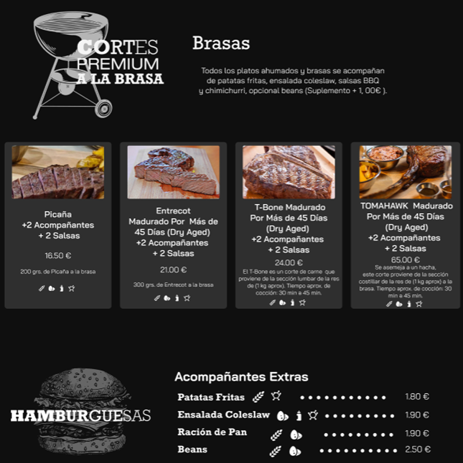
Given the user accesses the menu on desktop or mobile, when they navigate through the different sections, then the dishes are displayed clearly and organized by categories, allowing each category to be easily identified without content overload.
Given the user is browsing any page of the website, when they want to make a reservation, then they can easily find the highlighted “Booking” button in the navigation bar and in a section dedicated to this CTA on each page.
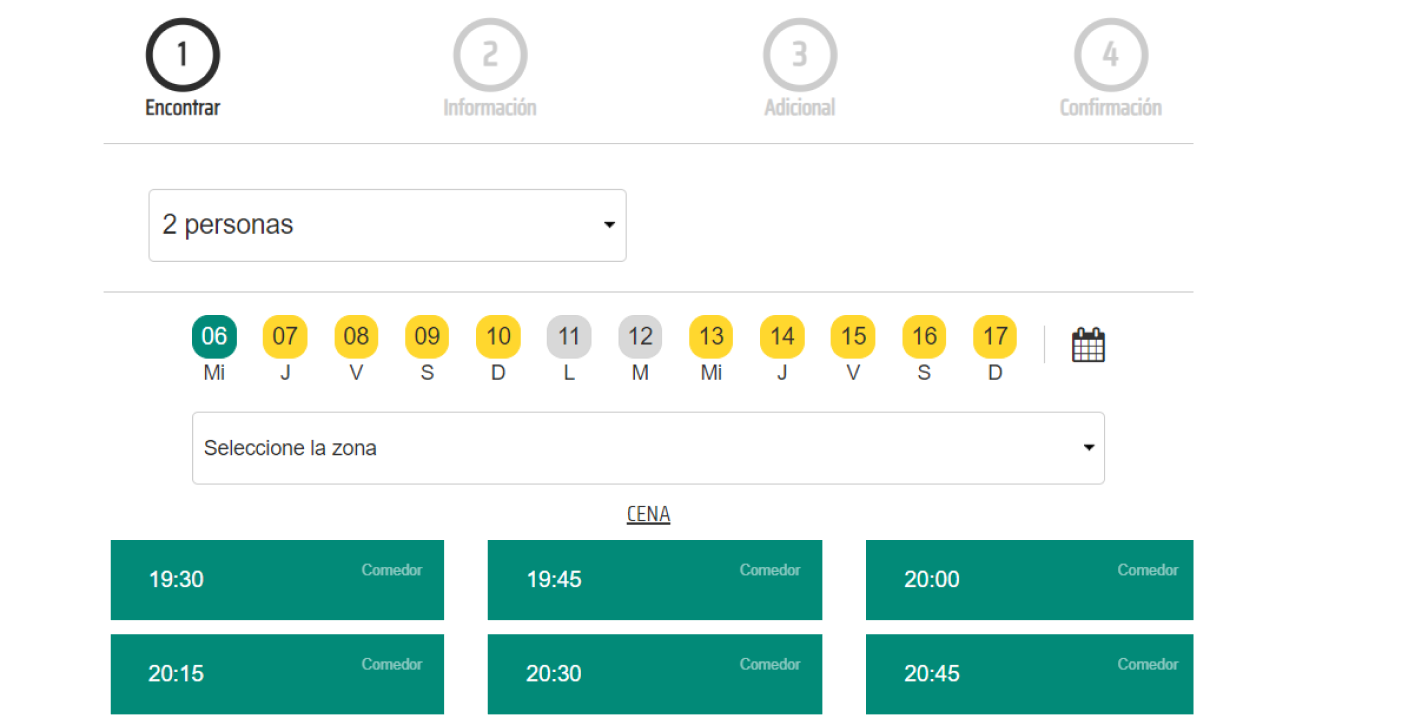
Given the user has started the table reservation process, when they move through the steps, then they see a clear progress bar that reduces anxiety and allows them to complete the reservation in just a few steps.
Developer Handoff
Delivery of the Figma file with extra notes for states, interactions, and breakpoints.
UX documentation with key insights and recommendations.
Documentation and delivery of the complete design system to ensure project scalability.
Exported visual kit: icons, optimized images, color tokens.
A meeting prior to development was held with the cross-functional team, during which the prototype was presented and explained in detail.
Follow-up meetings were held during the development process to ensure consistency.
07.Test
Due to the limited project budget, it is recommended to implement web analytics tools such as Google Analytics, heatmaps, and user session recordings to analyze real user behavior on the website, particularly during the booking process. This information will allow us to identify friction points and drop-off points, validate design decisions, and implement improvements based on real data.