Memorama is a project created with the aim of providing support, mainly during the perinatal grieving process, through an editable tool that keeps the memory of the loved one alive. Its main product is Memorama Bebé, a customizable book created to honor and remember those who left us too soon. In addition, Memorama has other products for other types of grief and seeks to build a supportive community for people experiencing perinatal grief and other types of loss, always from a human, caring, and respectful approach, using understanding language that conveys calm and support at all times.
The lack of a space and a tool that allows people to honor and keep alive the memory of a loved one who passed away prematurely, aimed at people who are experiencing perinatal grief and who, in many cases, do not find sufficient support or companionship in society.
Constraints
Communication had to be handled with particular care due to the psycho-emotional context, which limited certain design and promotional communication decisions.
The reduced budget only allowed for an initial research phase, without the possibility of iterative testing or extensive field studies.
The project only included one complete iteration and design phase.
The product direction was not yet defined, and the lack of a clear strategy made it difficult to project future developments in the roadmap.
Prioritization Framework: Impact vs. Effort
02. Research & Empathize
Hypothesis
The creation of Memorama, its digital site and products will help people experiencing perinatal grief and those close to them to process their loss in a more supportive and meaningful way, while also helping to fill a gap that exists in Spanish society with regard to this sensitive issue.
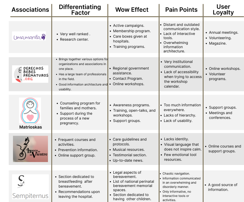
Benchmarking
Research Approach
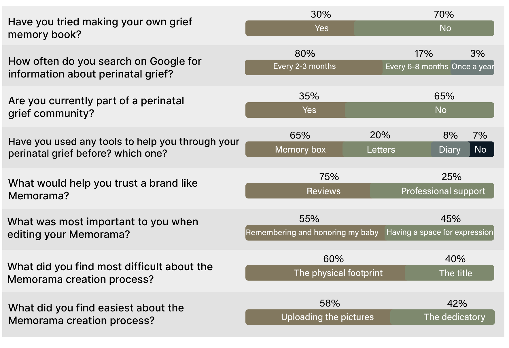
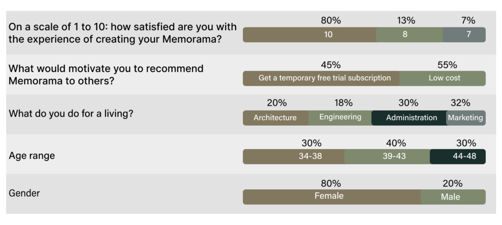
In the first phase of the research, an analysis was conducted of the competition and existing options on the market that offer tools to help with perinatal grief. In the second phase, interviews were conducted with 15 users, 80% of whom were women and 20% men, aged between 34 and 48, after they had interacted with Memorama branded material and edited a Memorama Bebé (dedicated to perinatal grief).
Research Results
Insights
These are the most significant points that have been discovered during the research phase. These points should be taken into account in the structuring and design of the website.
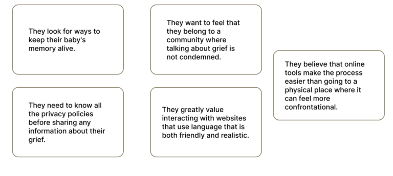
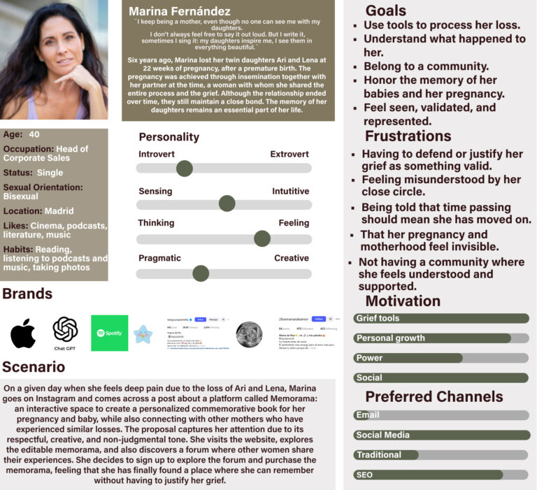
Empathy Map
In this phase, I conducted an in-depth exercise to fully understand and empathize with users' behaviors, needs, and desires.
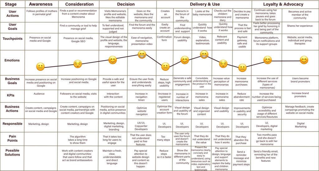
This is the customer journey before, during, and after using the website. This helps us identify pain points to alleviate them and make the design more efficient by anticipating user needs and ensuring a user-centered experience.
Solution
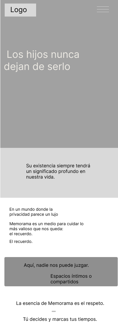
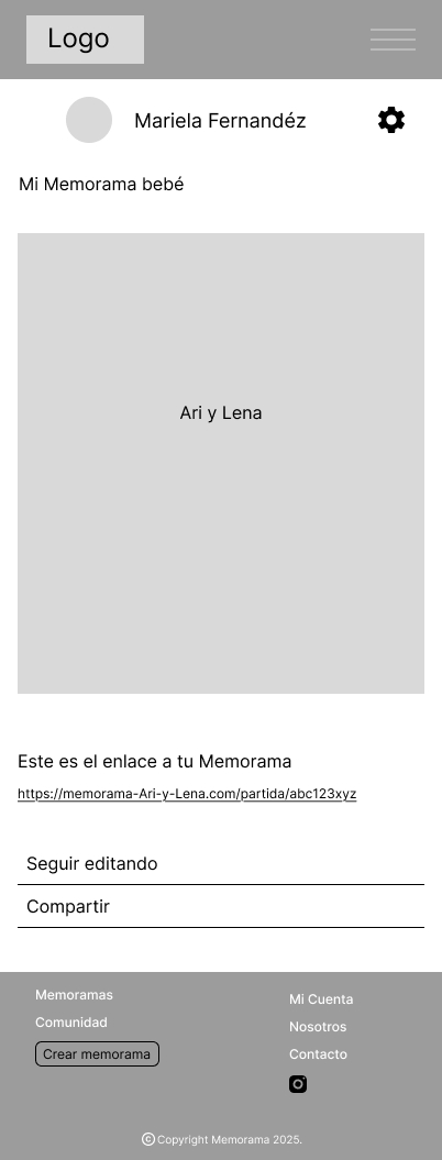
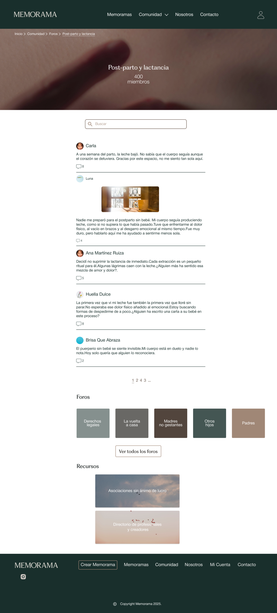
Memorama is designed as an online community space and set of tools dedicated to supporting perinatal grief and other types of grief, which takes into account the feelings, concerns, and needs of both those going through this process and their close circle. It is a space that offers empathetic support, where tranquility, inspiration, and the possibility of expressing grief in a creative and respectful way prevail.
04.Ideate
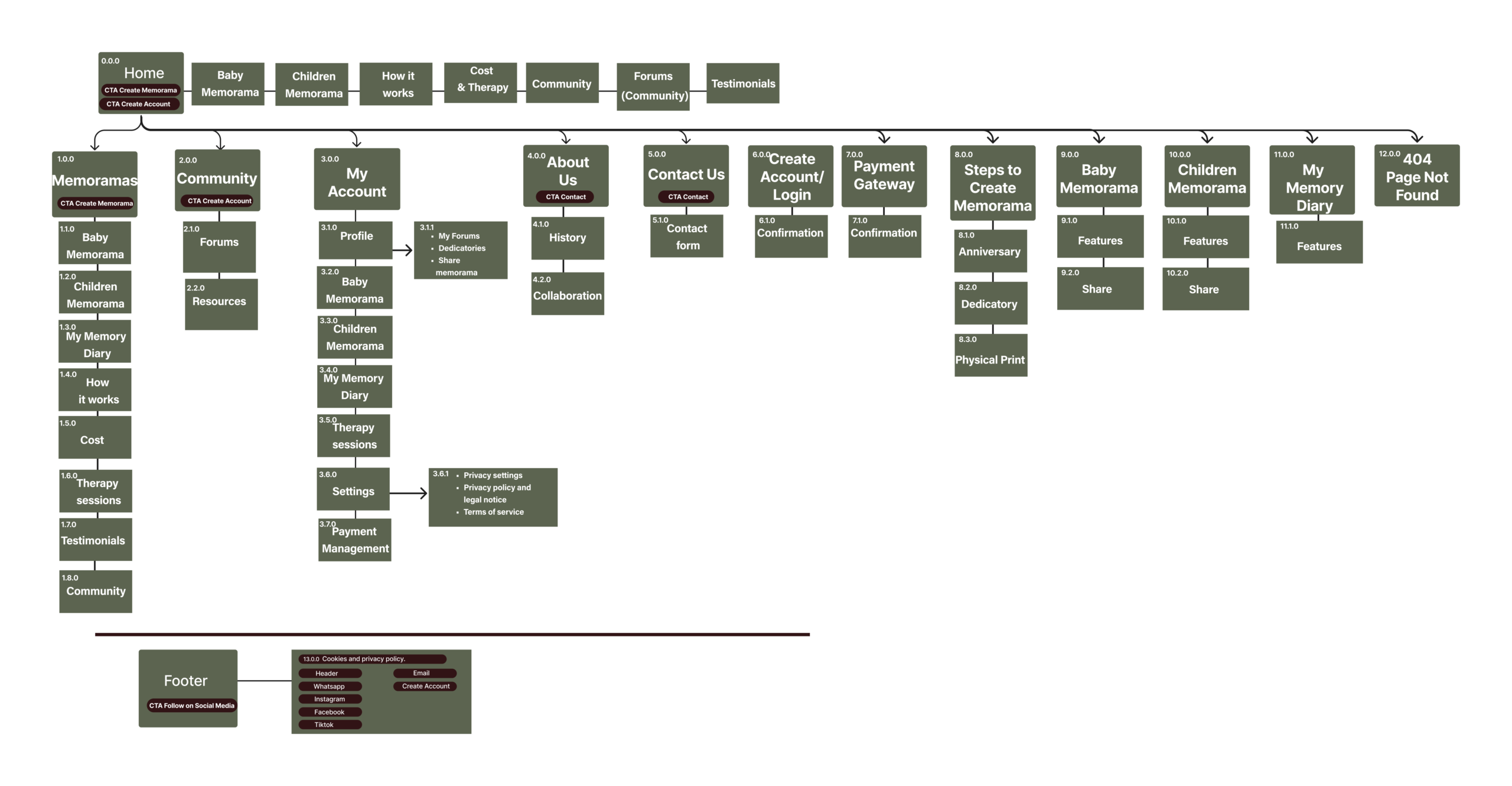
Sitemap
Here, we define the information architecture, strategically placing CTAs (Calls to Action) and organizing the website content to optimize Google ranking and the workflow during both the design and development processes.
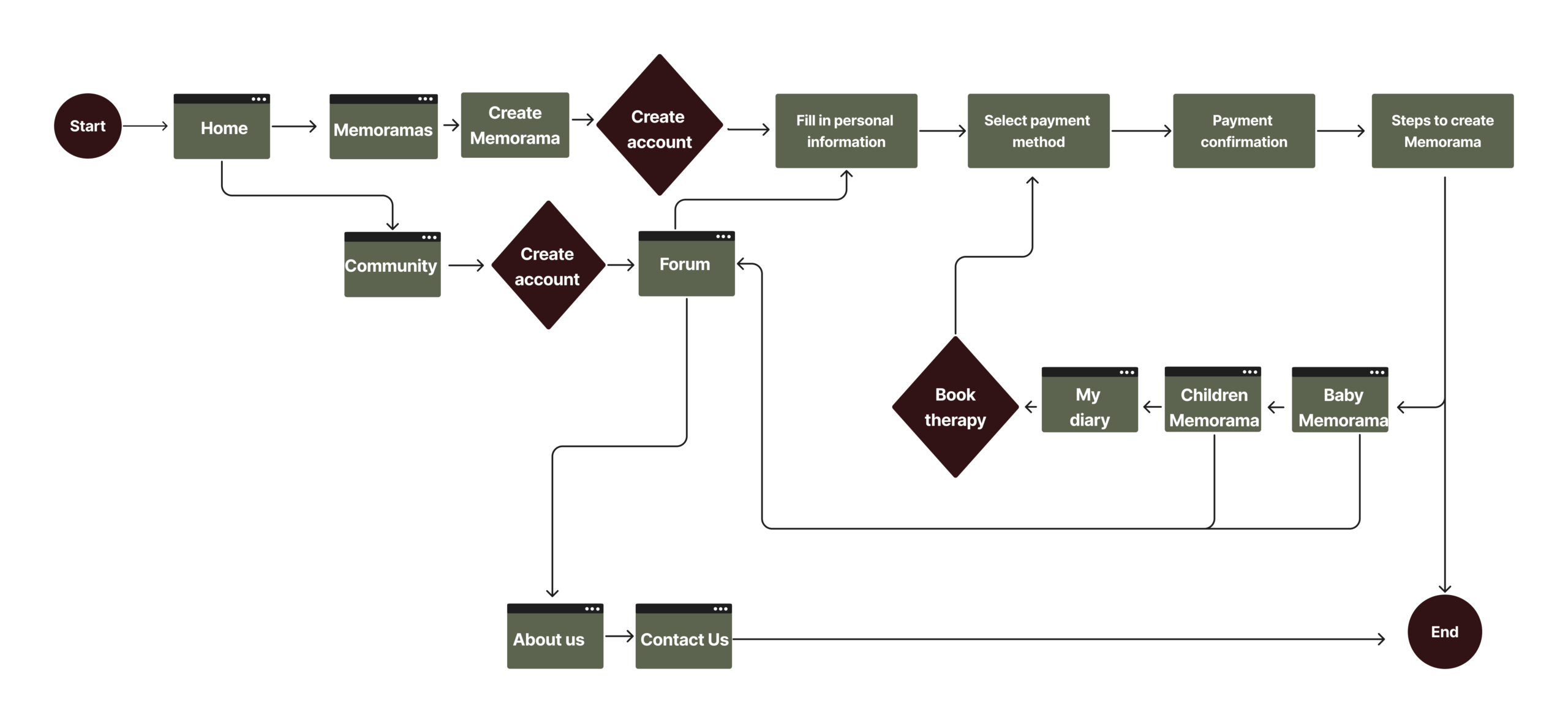
User Flow
This is the sequence of actions that users take within the website. Mapping these actions is essential for optimizing interactions and navigation, making the website more user-friendly and increasing conversion rates by strategically positioning CTAs.
05.Prototype
Wireframe
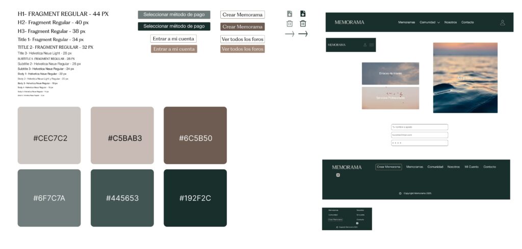
UI Kit
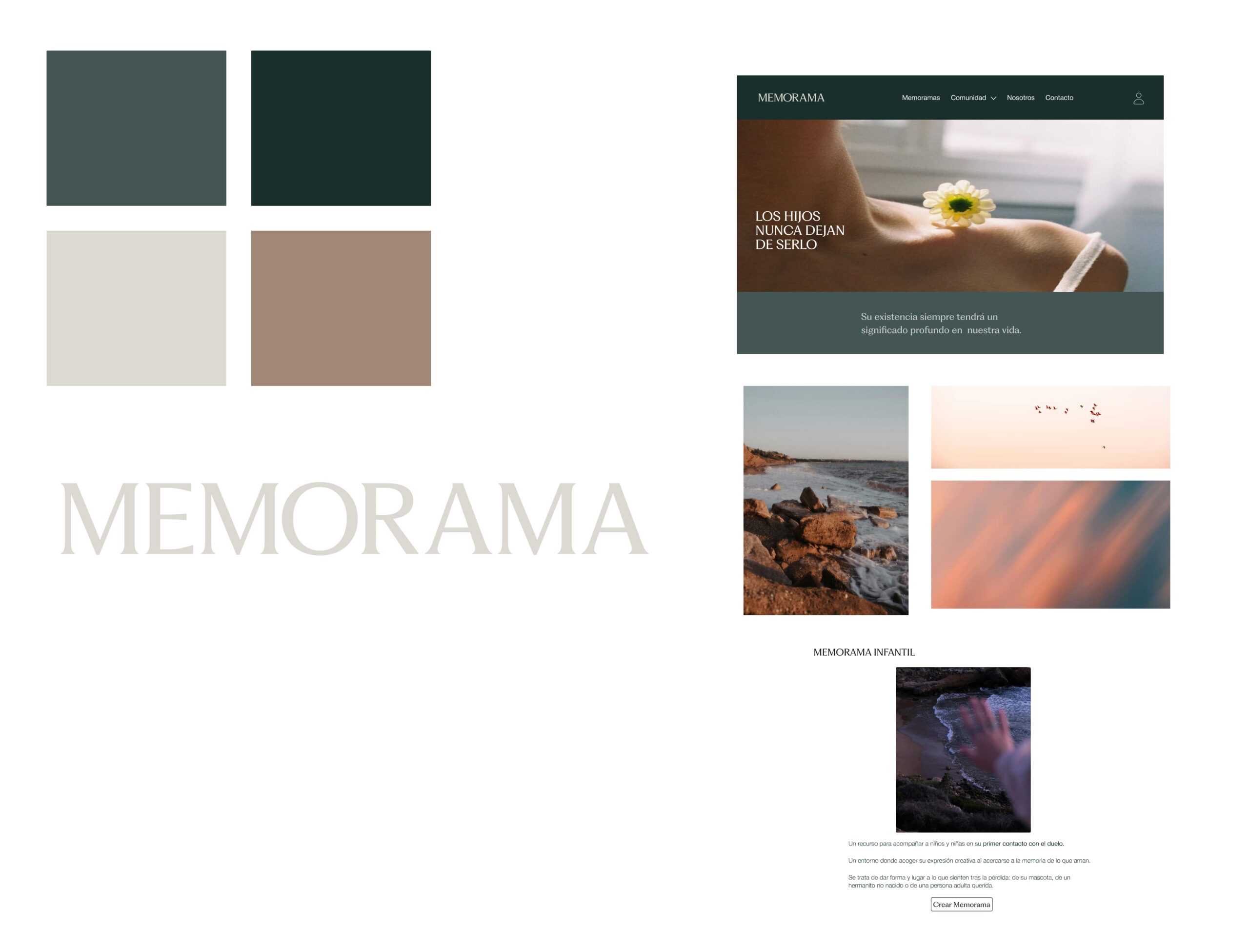
Look & Feel
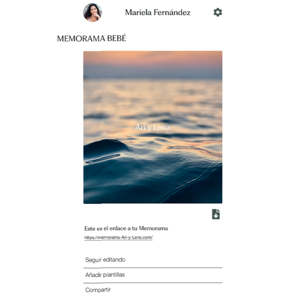
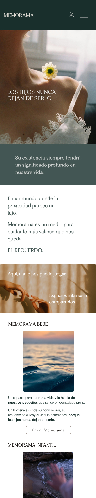
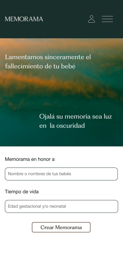
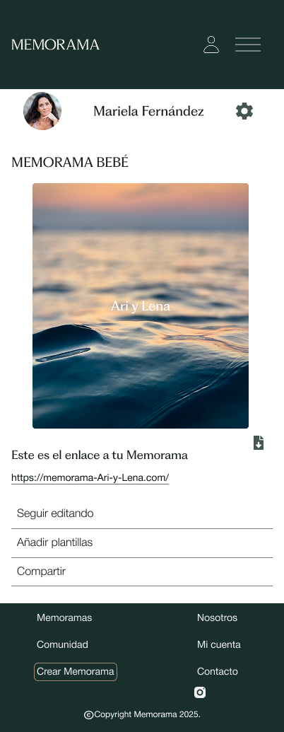
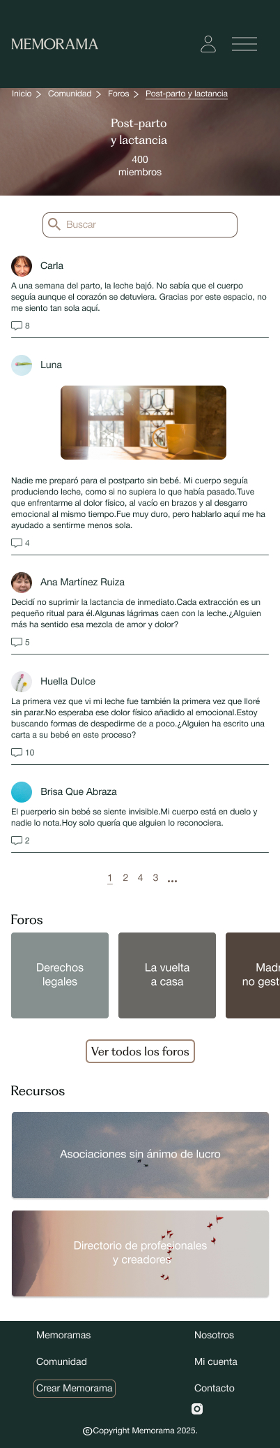
Mobile UI
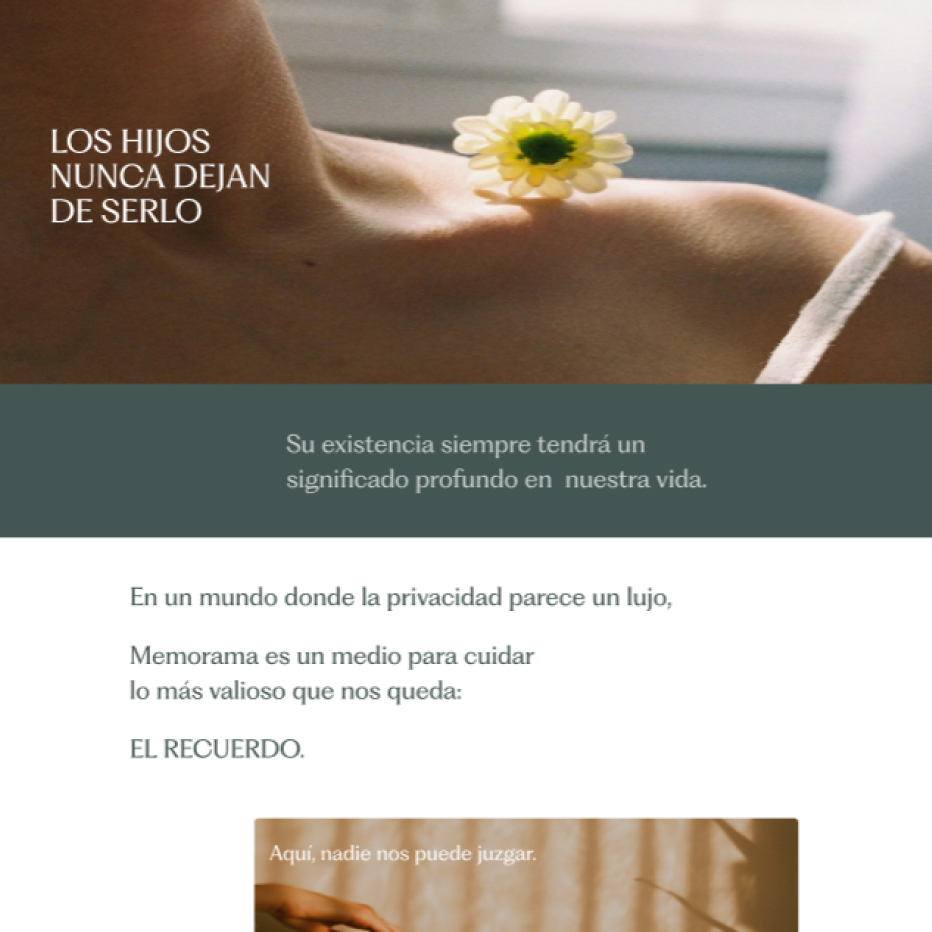
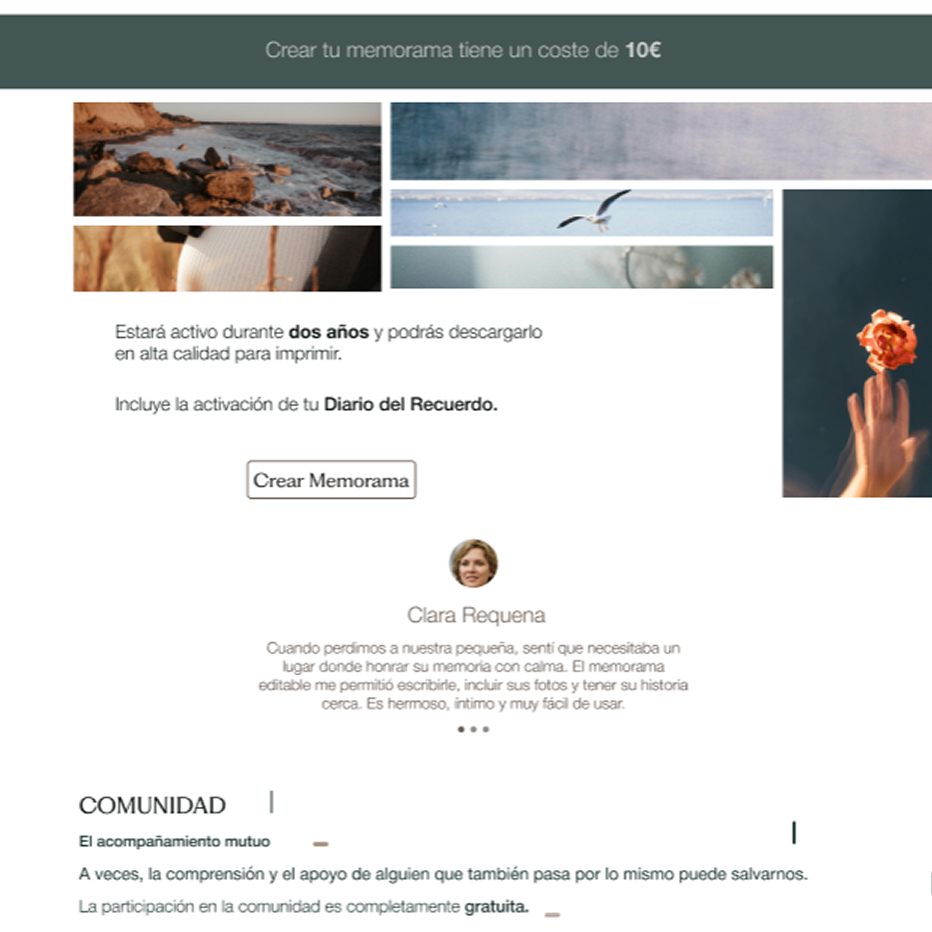
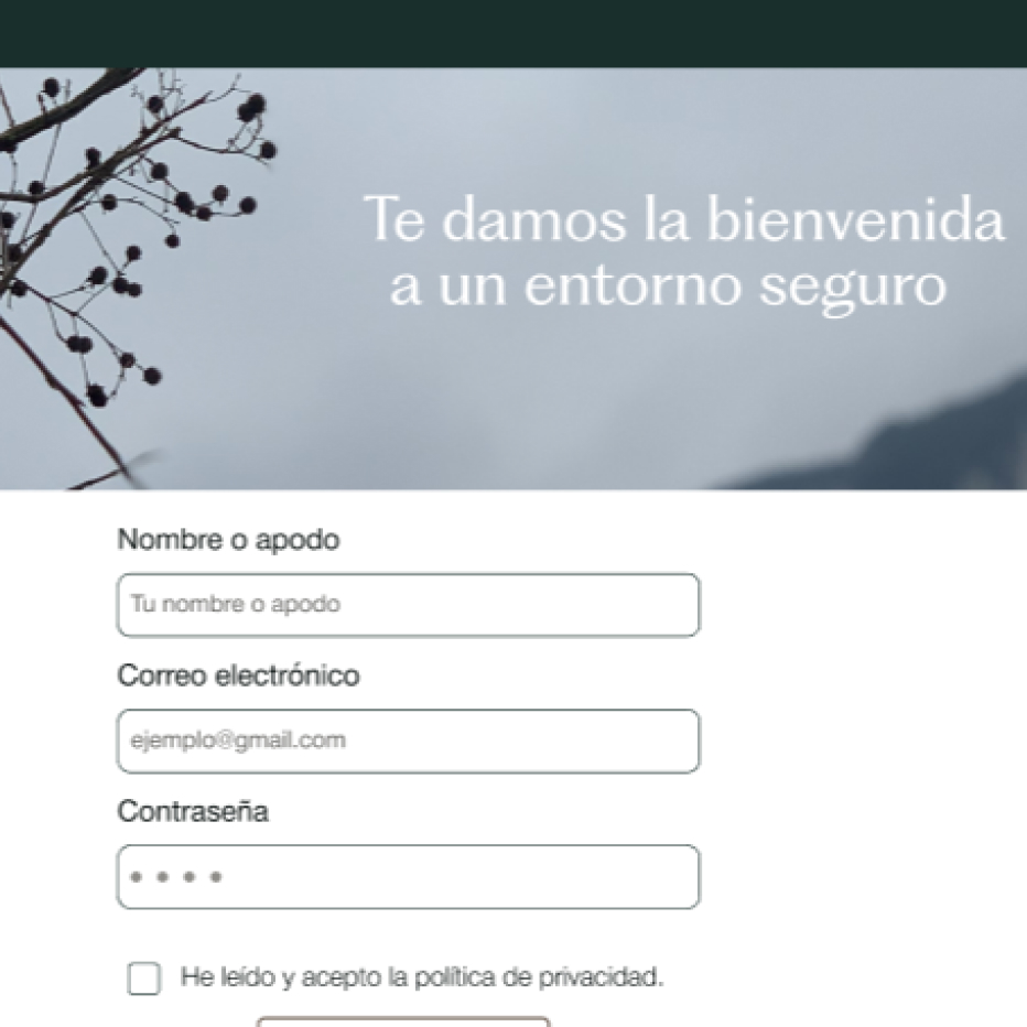
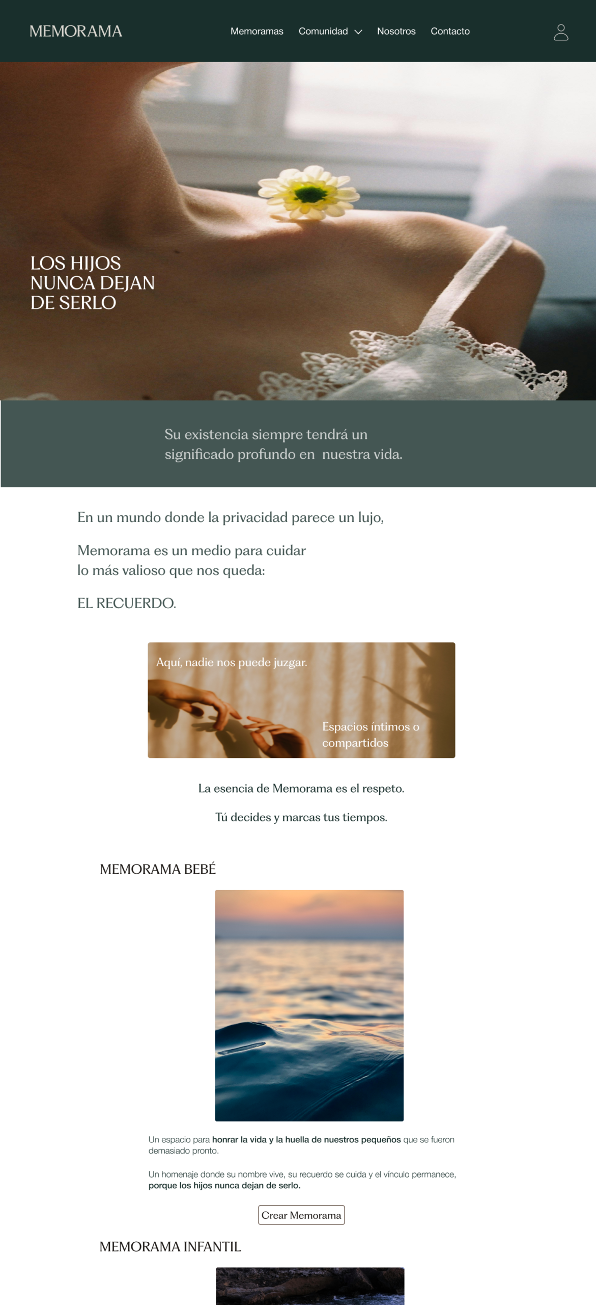
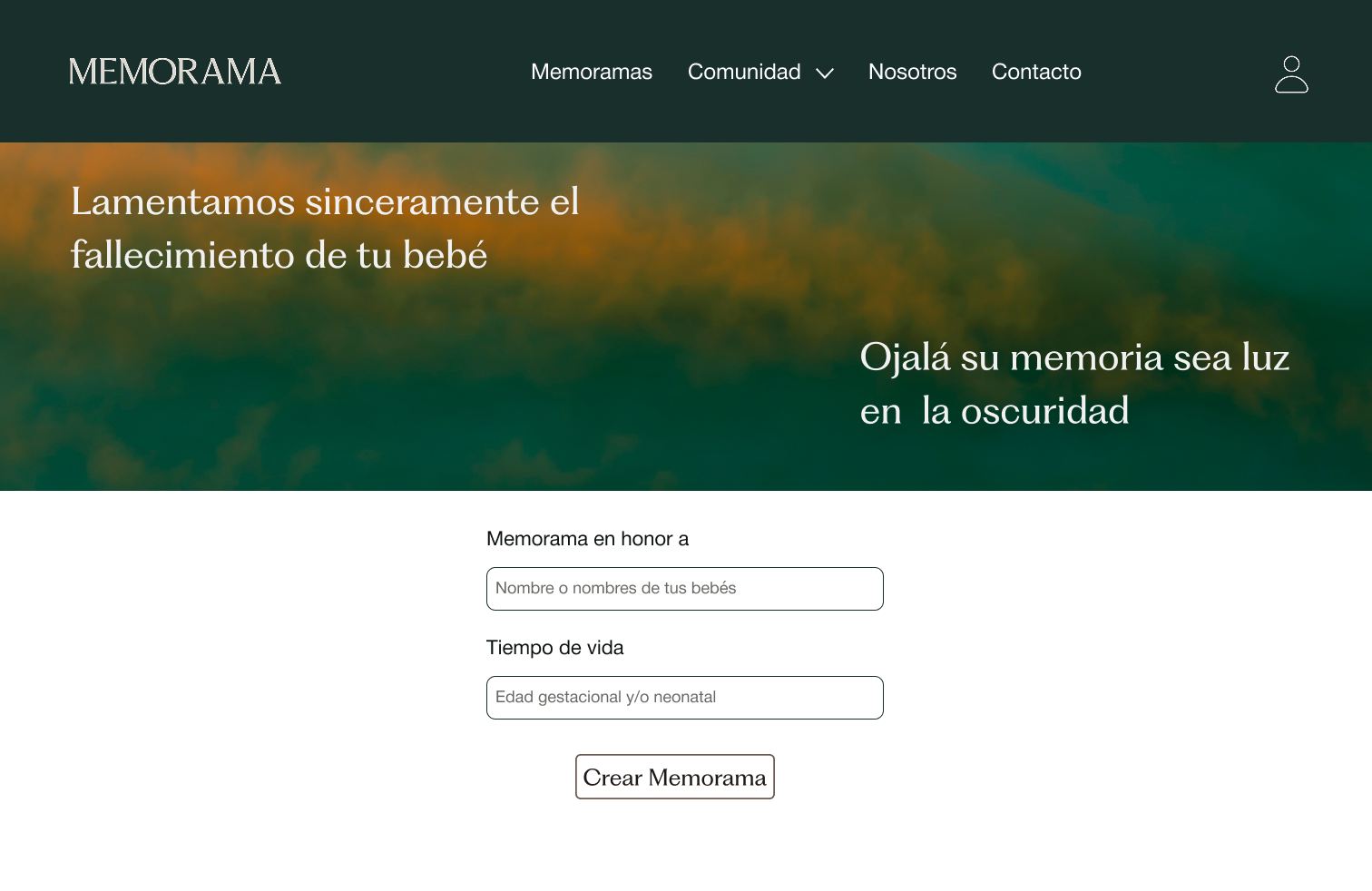
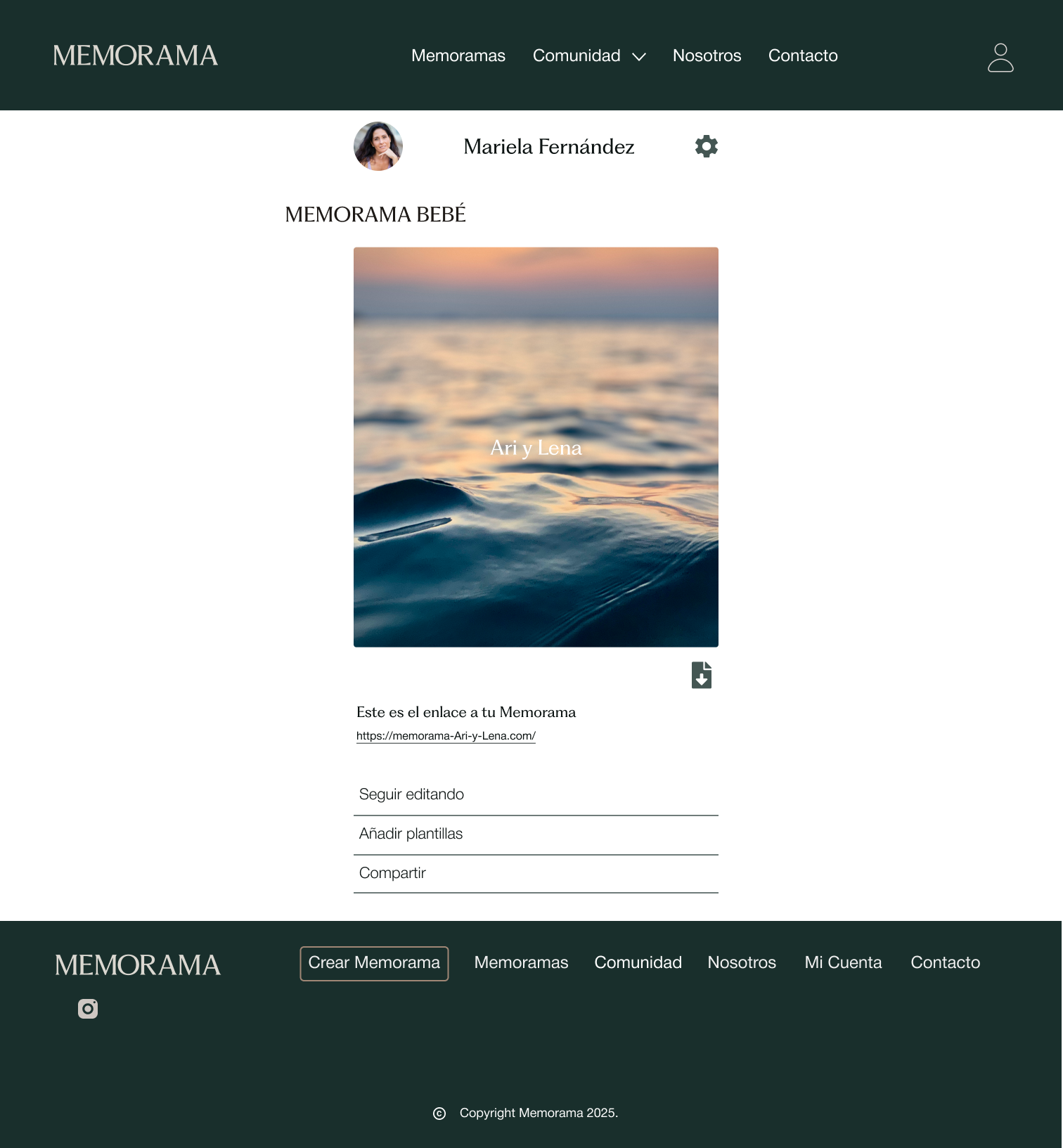
Desktop UI
06.Delivery
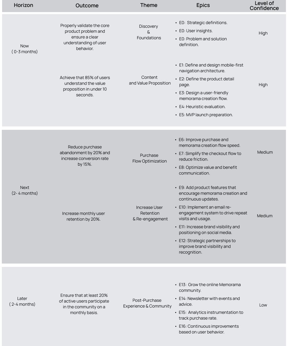
Roadmap
High-Level Backlog
This backlog represents a strategic view of the product. Execution was carried out in iterative sprints of 2 to 3 weeks.
Acceptance Criteria
Given the user accesses any page of the website, when they navigate through the main sections (home, products, memorama creation), then they find the information organized in a clear, friendly, and approachable way.
Given the user visits the product page, when they review the description, images, and attributes, then they understand in less than two minutes what the product includes and how the creation process works.
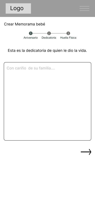
Given the user starts creating their memorama, when they move through the steps, then they receive clear instructions at each stage, see a step-by-step feedback progress bar, and can skip some steps or modify them later.
Developer Handoff
Delivery of the Figma file with extra notes for states, interactions, and breakpoints.
UX documentation with key insights and recommendations.
Documentation and delivery of the complete design system to ensure project scalability.
Exported visual kit: icons, optimized images, color tokens.
Heuristic usability documentation for implementation.
A pre-development meeting was held with the cross-functional team, during which the prototype was presented and explained in detail.
Follow-up meetings were held during the development process to ensure consistency.
Decision-making meetings on the evolution of the products offered in the MVP.
07.Test
Memorama is a project that places special emphasis on user experience, so it is recommended to implement a landing page dedicated to a single product to test key messages, value propositions, and different calls to action. If possible, it is also advisable to incorporate A/B testing to refine analysis and decision-making regarding improvements. Likewise, it is essential to integrate Google Analytics along with heatmaps and session recordings to analyze actual user behavior and continuously optimize the experience based on data.