Manu’s Surf Shop is an online store which sells surfboards, accessories, wetsuits and clothing, for clients in California, this e-commerce venture is intended to be exclusively digital and bring close communication, employing a friendly language for the surfing community in this state.
The surf shop market in California is saturated with online stores that lack proximity and a real understanding of surfers’ needs, motivations, and goals. Many of these brands fail to generate an authentic connection with their users or build a community around the sport.
Constraints
The project scope was limited to the design of the MVP, with no allocation for in-depth user research or iterative validation cycles.
The lack of an in-house image library required the use of generic or third-party visual resources.
The California market presented a highly competitive landscape, requiring the value proposition to stand out among numerous surf shops in the region.
Development was constrained by a reduced budget, requiring all solutions to be technically feasible within limited resources.
Prioritization Framework: Impact vs. Effort
02.Research & Empathize
Hypothesis
Developing an e-commerce website dedicated to selling surf products, with a strong brand identity and a focus on customer loyalty. The online store should be optimized for SEO and foster a strong connection with the Californian surfing community, ensuring they feel represented and engaged. This approach will enhance brand trust and streamline the purchasing process.
Benchmarking
Research Approach
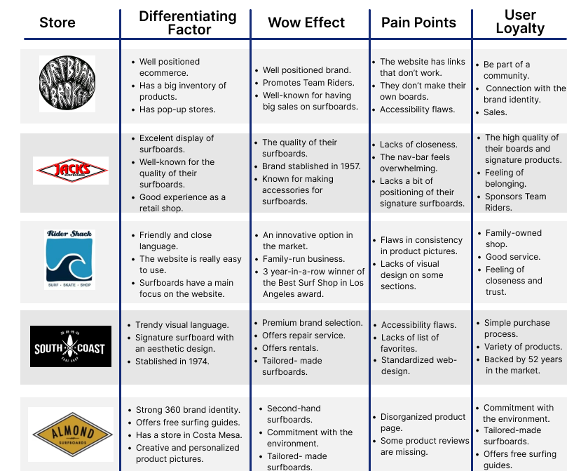
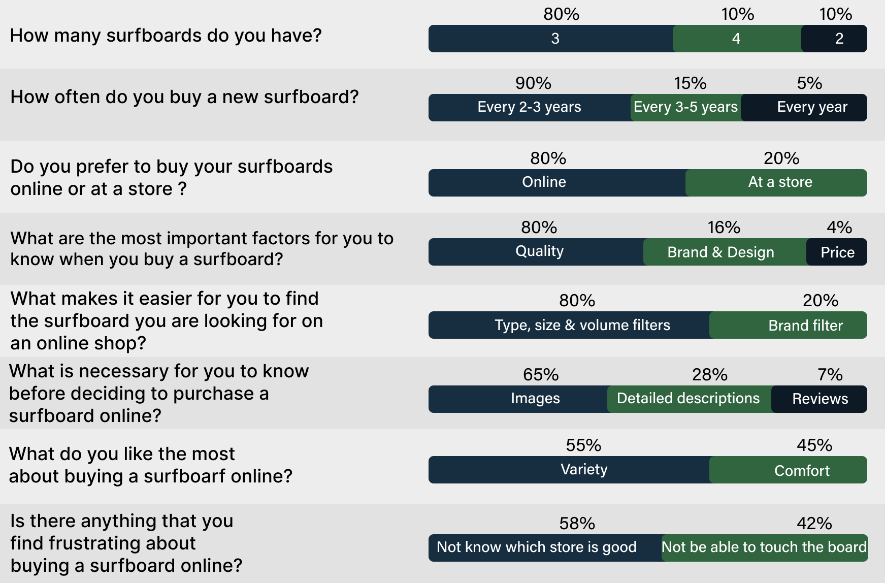
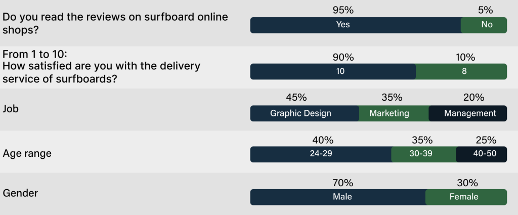
The first step was an analysis of the competition to understand and evaluate the current market of online sales of surfing products in California. During the research phase, a group of 22 users were interviewed, 70% of whom were men and 30% women, aged between 25 and 50. These users are committed surfers who want to buy new surfboards, accessories, and clothing from time to time.
Research Results
Insights
These are the most significant points that have been discovered during the research phase. These points should be taken into account in the structuring and design of the website.
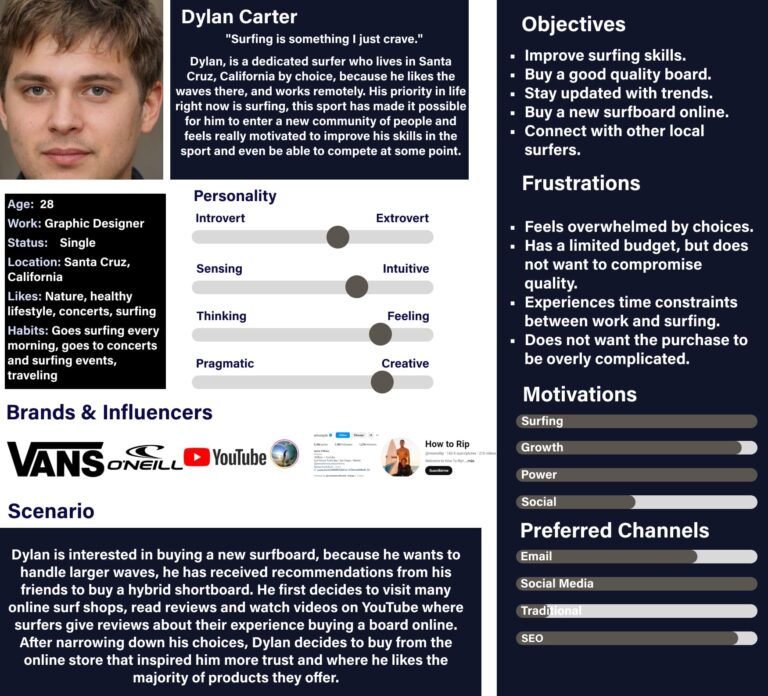
Empathy Map
In this phase, I conducted an in-depth exercise to fully understand and empathize with users' behaviors, needs, and desires.
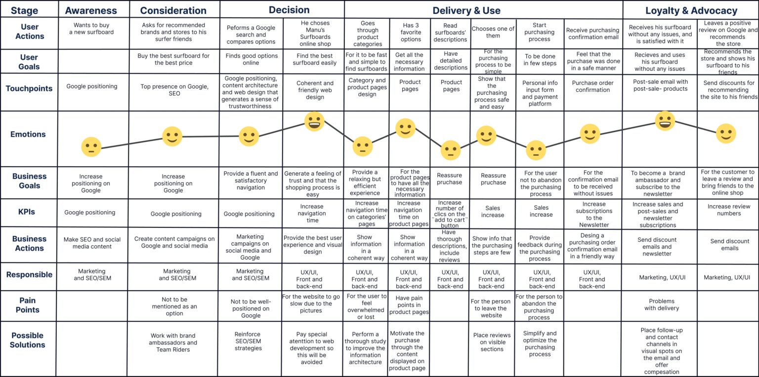
This is the customer journey before, during, and after using the website. This helps us identify pain points to alleviate them and make the design more efficient by anticipating user needs and ensuring a user-centered experience.
Solution
An e-commerce site with the visual and written language of a brand created by and for real surfers, this is the main channel for sales and connection with the community. This e-commerce seeks to offer a simple, accessible, and reliable shopping experience, facilitating access to surfboards, accessories, and clothing, while strengthening their bond with users through content, support in their progress in the sport, and the active promotion of an authentic surfing community.
04.Ideate
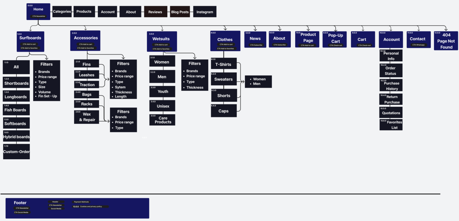
Sitemap
Here, we define the information architecture, strategically placing CTAs (Calls to Action) and organizing the website content to optimize Google ranking and the workflow during both the design and development processes.
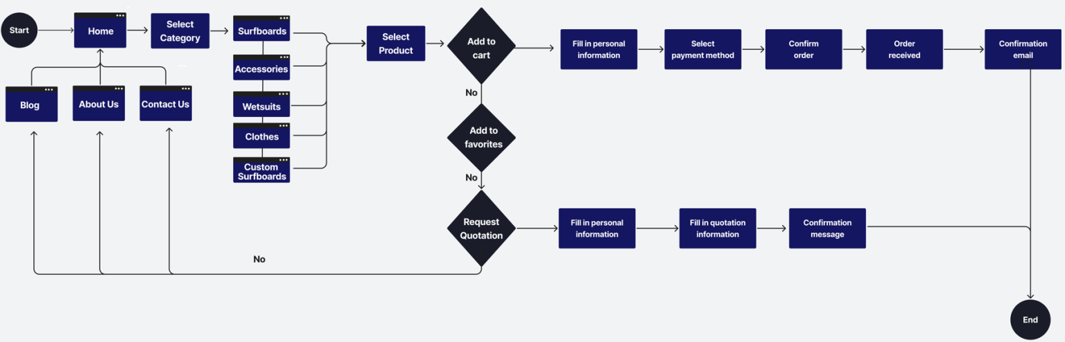
User Flow
This is the sequence of actions that users take within the website. Mapping these actions is essential for optimizing interactions and navigation, making the website more user-friendly and increasing conversion rates by strategically positioning CTAs.
05.Prototype
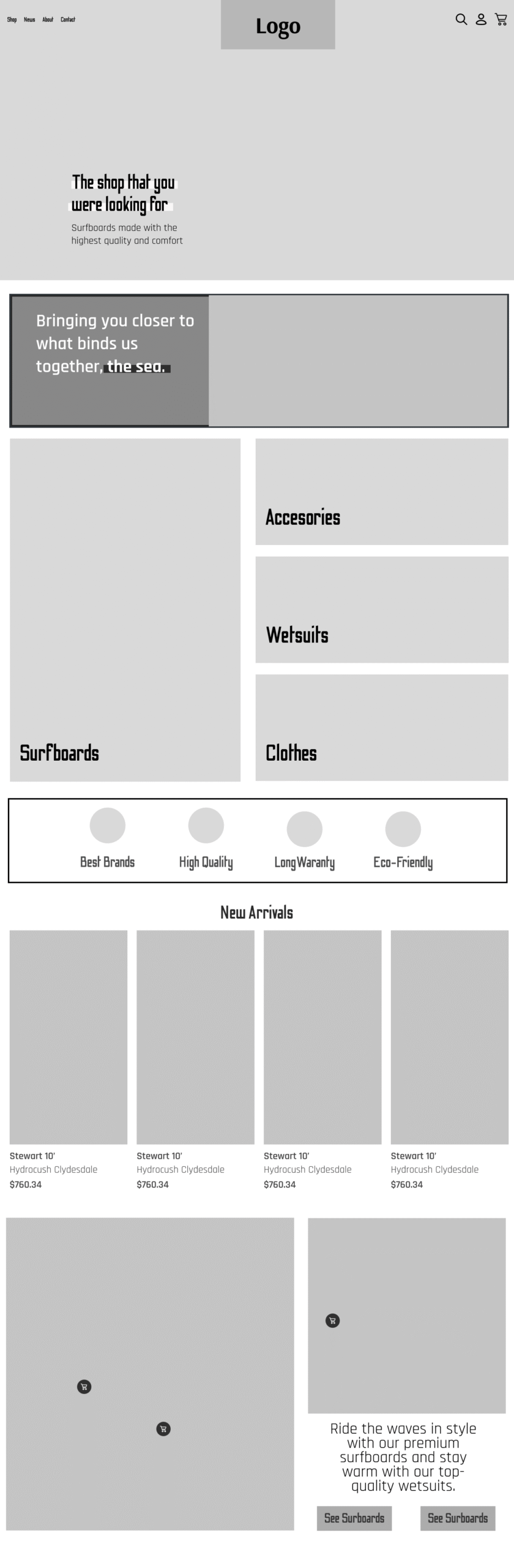
Wireframe
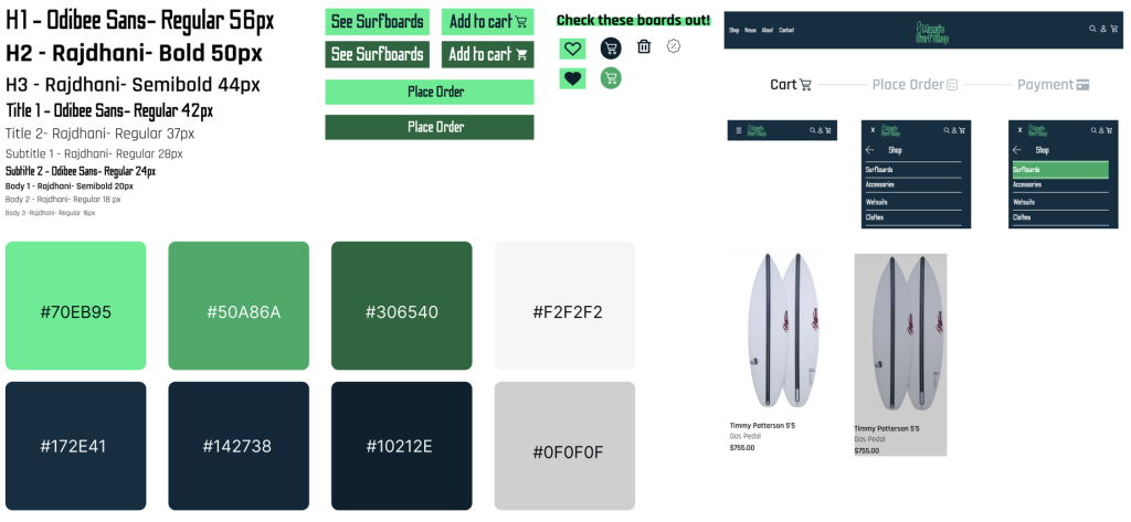
UI Kit
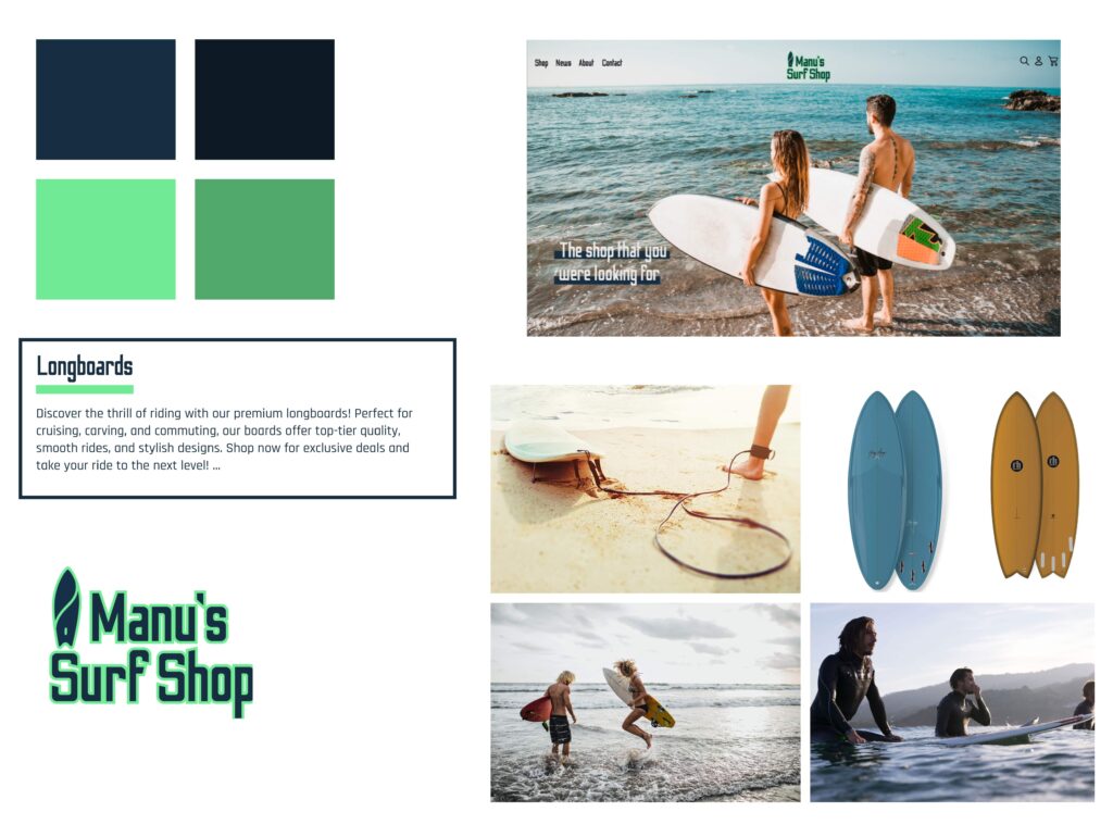
Look & Feel
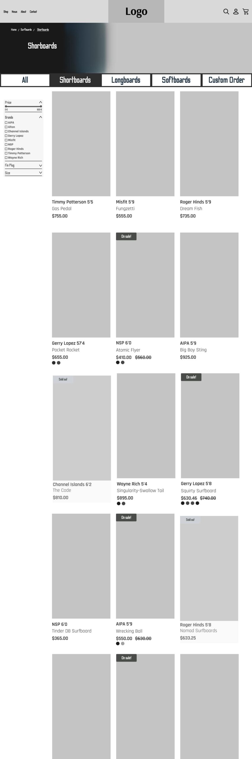
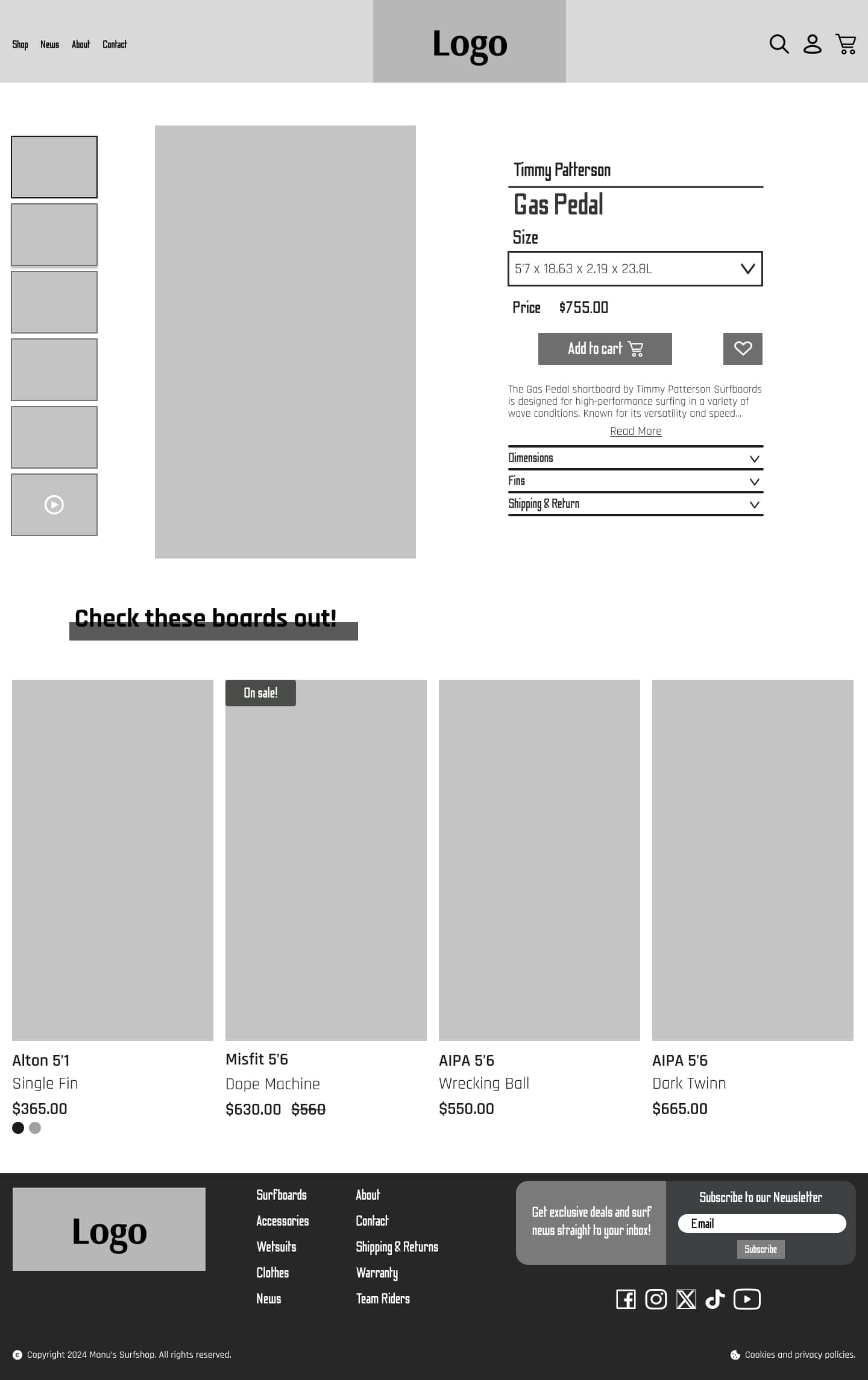
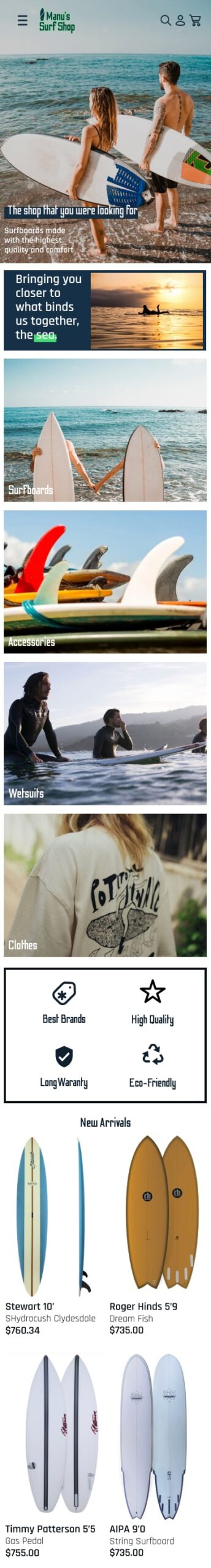
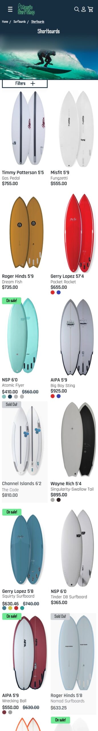
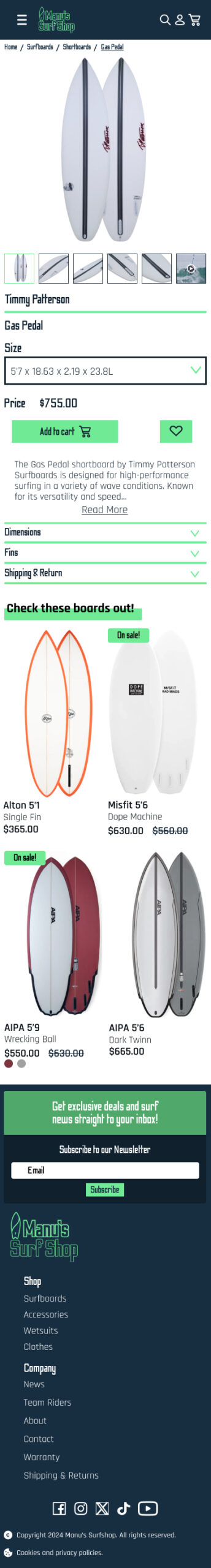
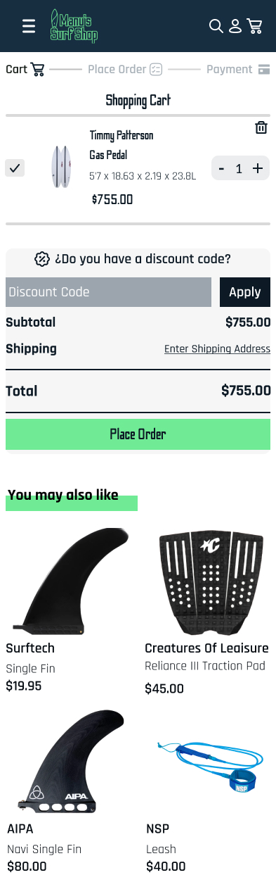
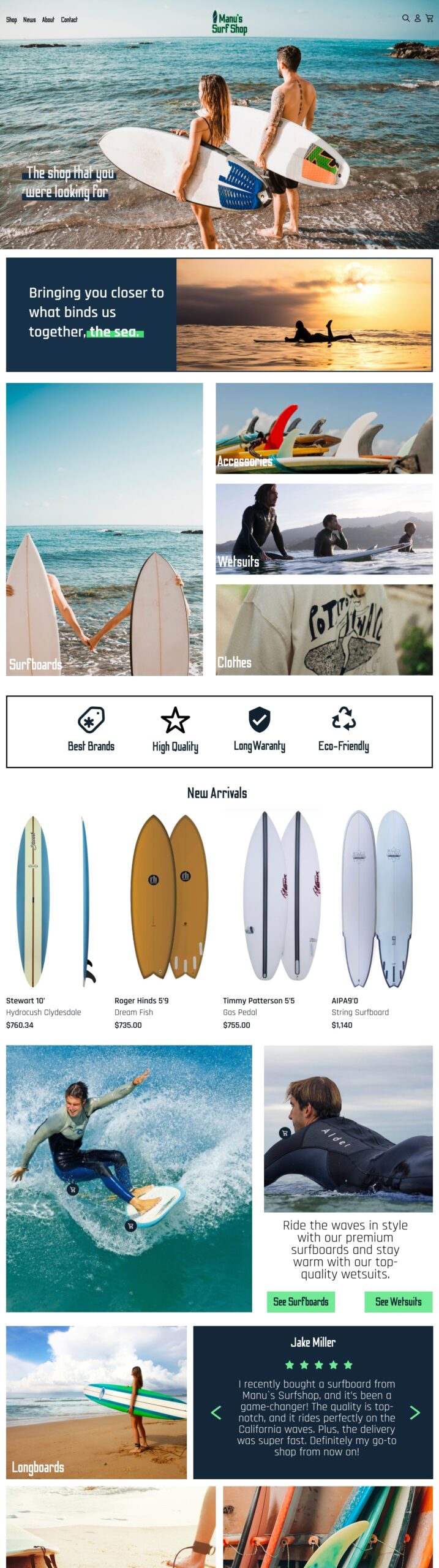
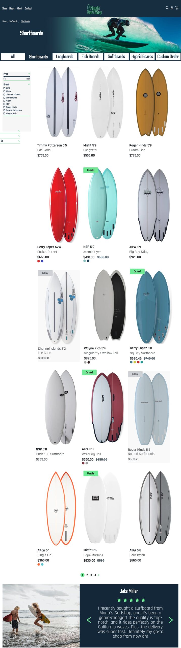
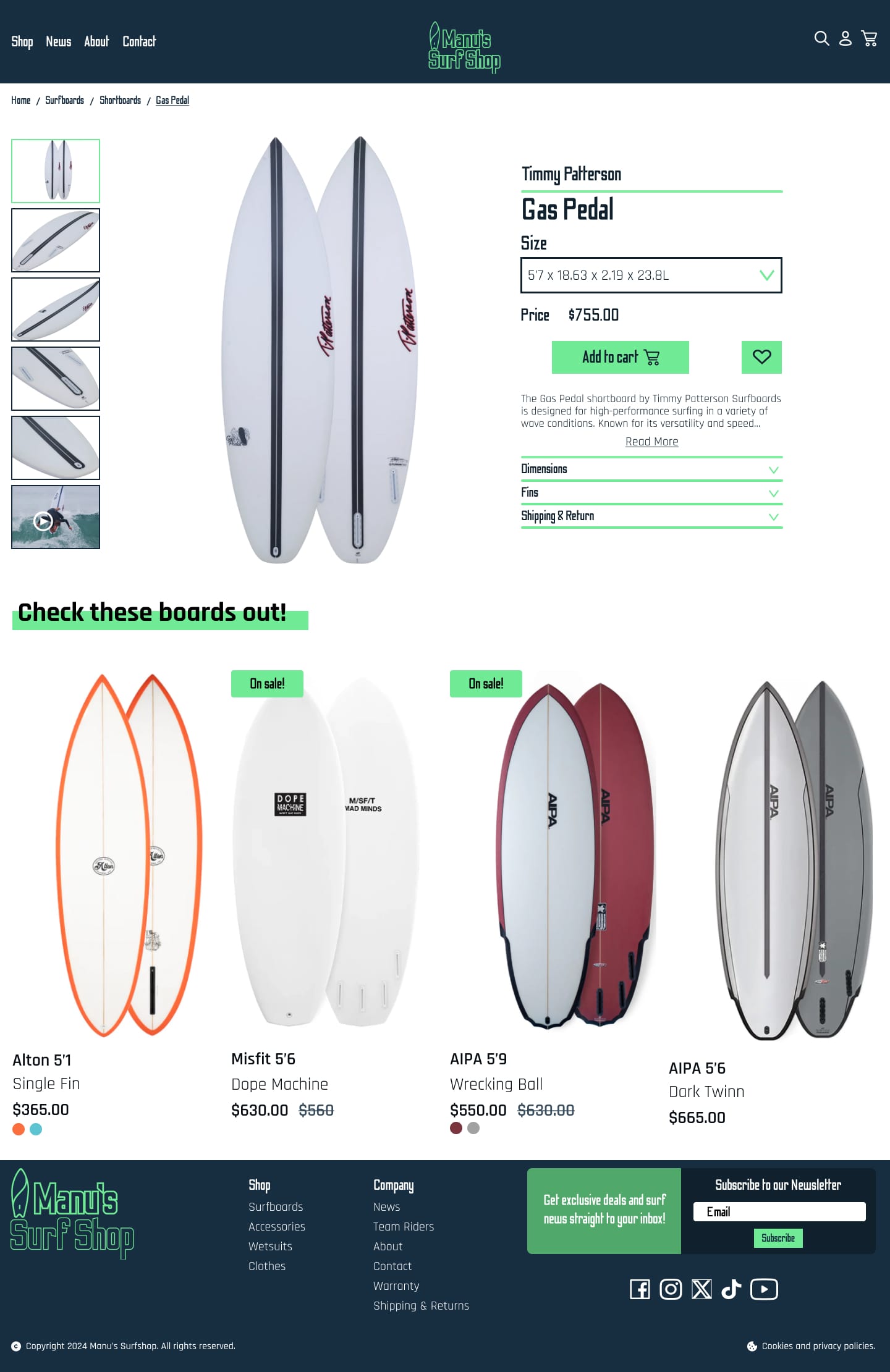
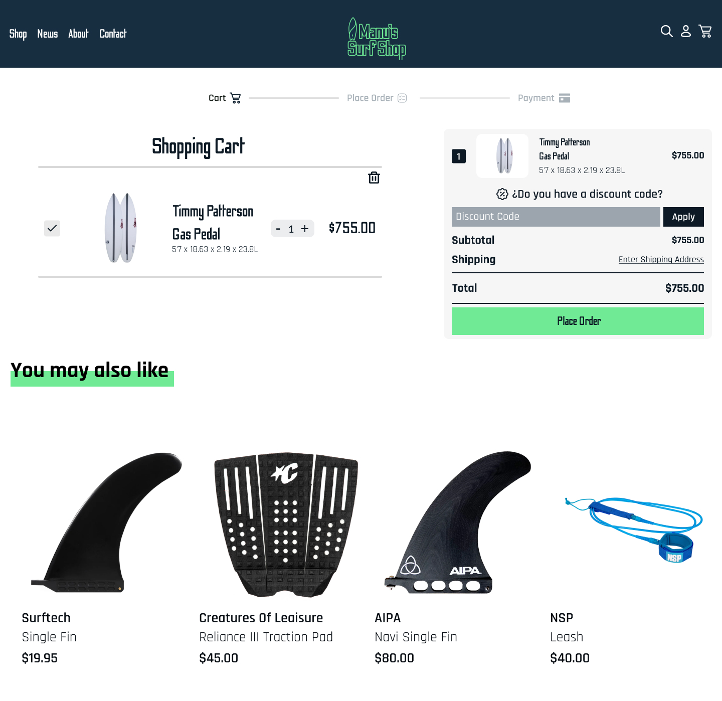
Mobile UI
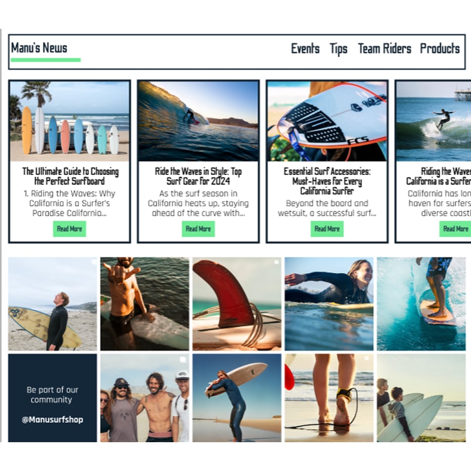
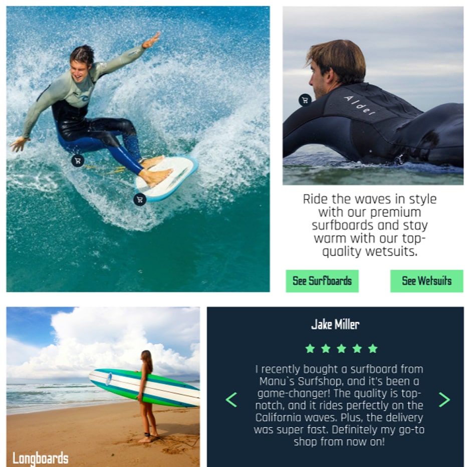
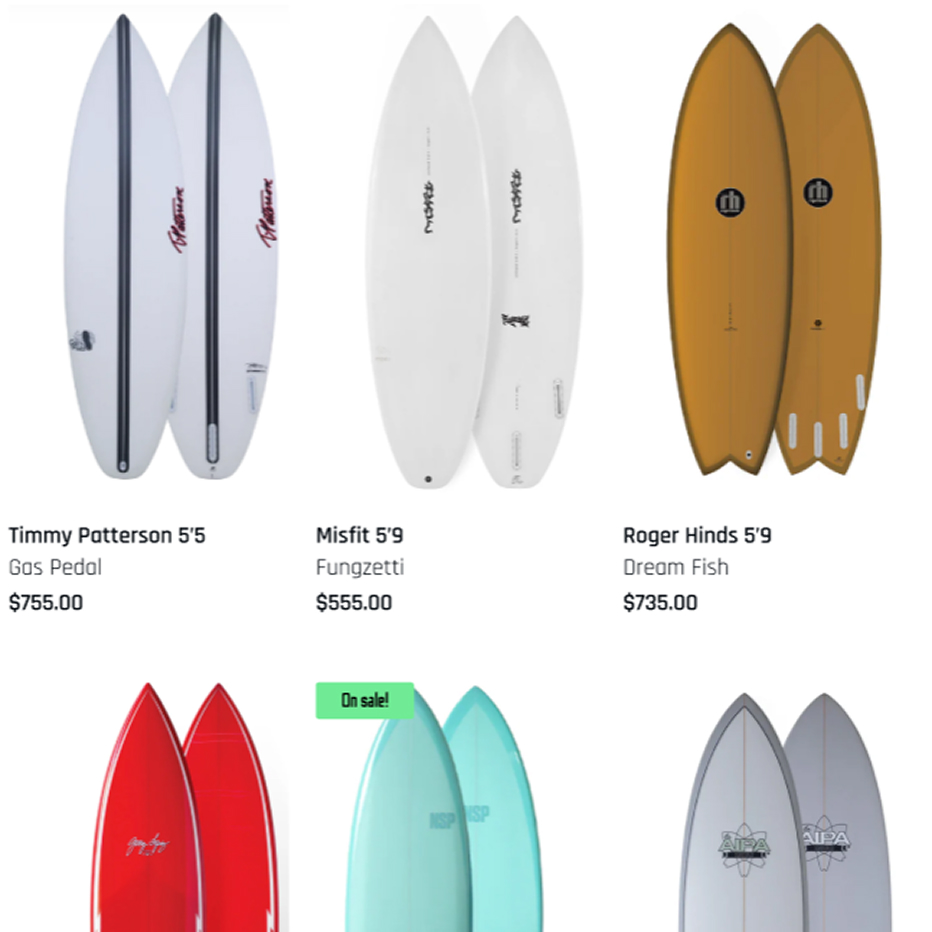
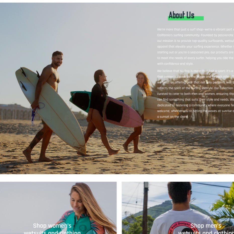
Desktop UI
06.Delivery
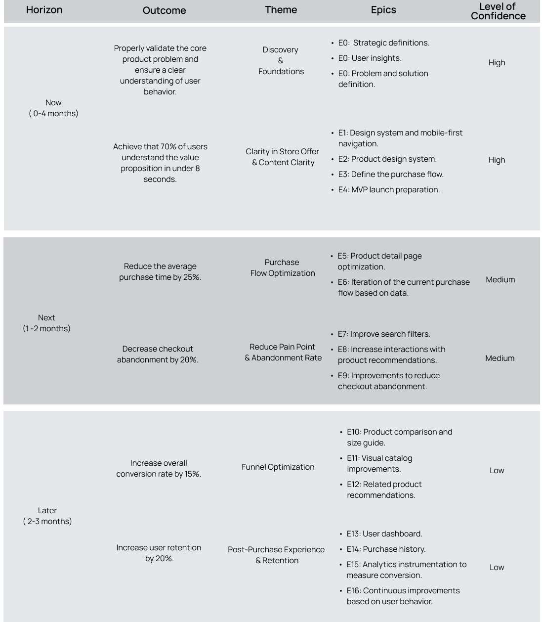
Roadmap
High-Level Backlog
This backlog represents a strategic view of the product. Execution was carried out in iterative sprints of 2 to 3 weeks.
Acceptance Criteria
Given the user enters the store, when they access the products section, then the list of available products is displayed with image, name, price, and size visible without the need to zoom-in.
Given the user is browsing the product catalog, when they apply filters by size, skill level, or price, then the results are displayed without reloading the page and only products that match the selected criteria are shown.
Given the user starts the checkout process, when they complete each step, then they receive visual feedback indicating the step status as active, completed, or with an error.
Developer Handoff
Delivery of the Figma file with extra notes for states, interactions, and breakpoints.
UX documentation with key insights and recommendations.
Documentation and delivery of the complete design system to ensure project scalability.
Exported visual kit: icons, optimized images, color tokens.
Heuristic usability documentation for implementation.
A pre-development meeting was held with the cross-functional team, during which the prototype was presented and explained in detail.
Follow-up meetings were held during the development process to ensure consistency.
07.Test
It was recommended to the client to follow up after the launch of the website through Google Analytics, performing A/B Tests and analyzing user sessions in Hotjar in order to see the real behavior of users, improve their experience and increase the conversion rate.