Redesign of the online store for Campos de Azahar, this is a brand dedicated to selling fresh produce from their farm and handmade marmalades. The goal of this redesign was to convey the freshness of their Valencian products and highlight the brand’s close relationship with its customers.
Problem
The online store did not communicate the handcrafted value of the product nor provide clear navigation. Users struggled to explore the catalog and complete the purchase process, especially on mobile devices.
Objective
To design an easy-to-understand e-commerce experience with visual communication aligned with the brand’s natural and handcrafted identity, improving navigation, product presentation, and checkout flow in order to increase conversion.
Insights
Users value the origin and authenticity of the product, but this information was previously presented in an overwhelming way.
The catalog had poorly differentiated categories, making quick exploration difficult.
Most users shop from mobile, which requires a lighter, clearer, and faster experience.
Pain Points
Lack of a clear structure for navigating the website.
Product detail pages with weak information hierarchy and limited visual support.
A purchase process with little feedback, which created friction.
Design Decisions
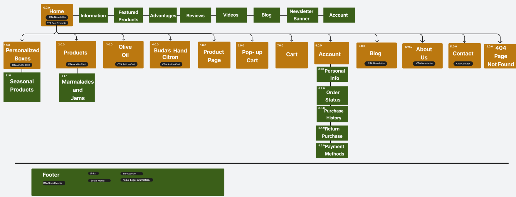
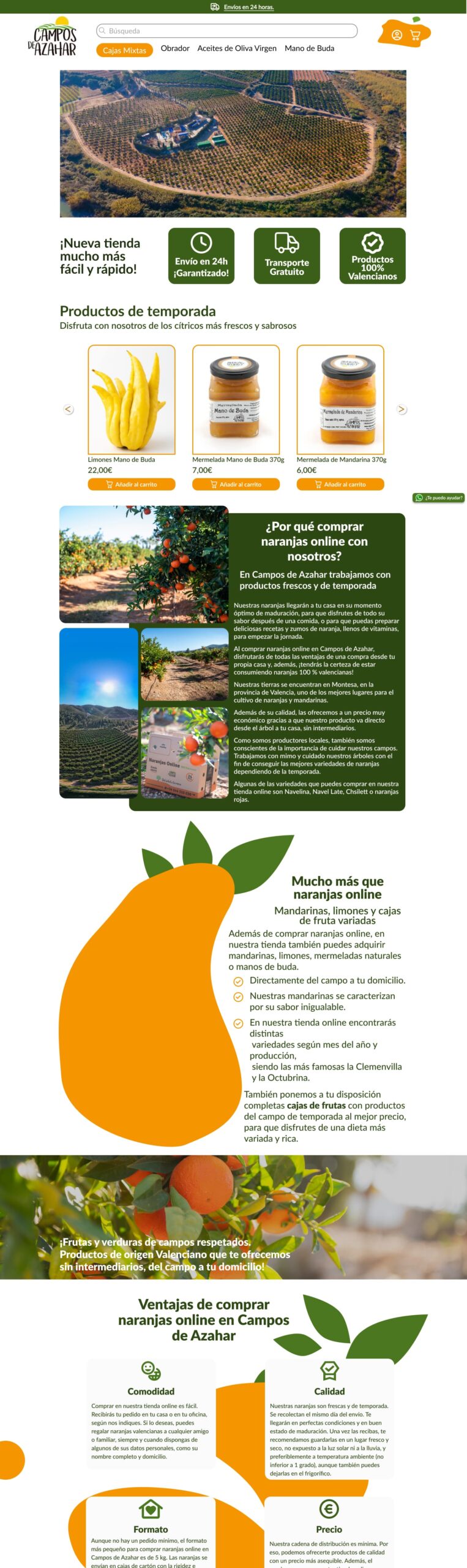
A simpler information architecture was defined, with clear categories and direct navigation.
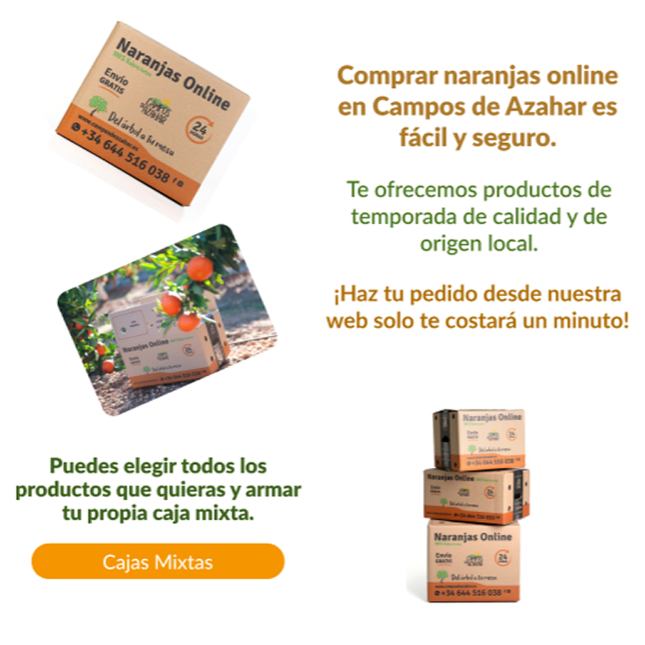
A look and feel was designed based on natural elements, textures, and colors inspired by the agricultural environment where the product originates from.
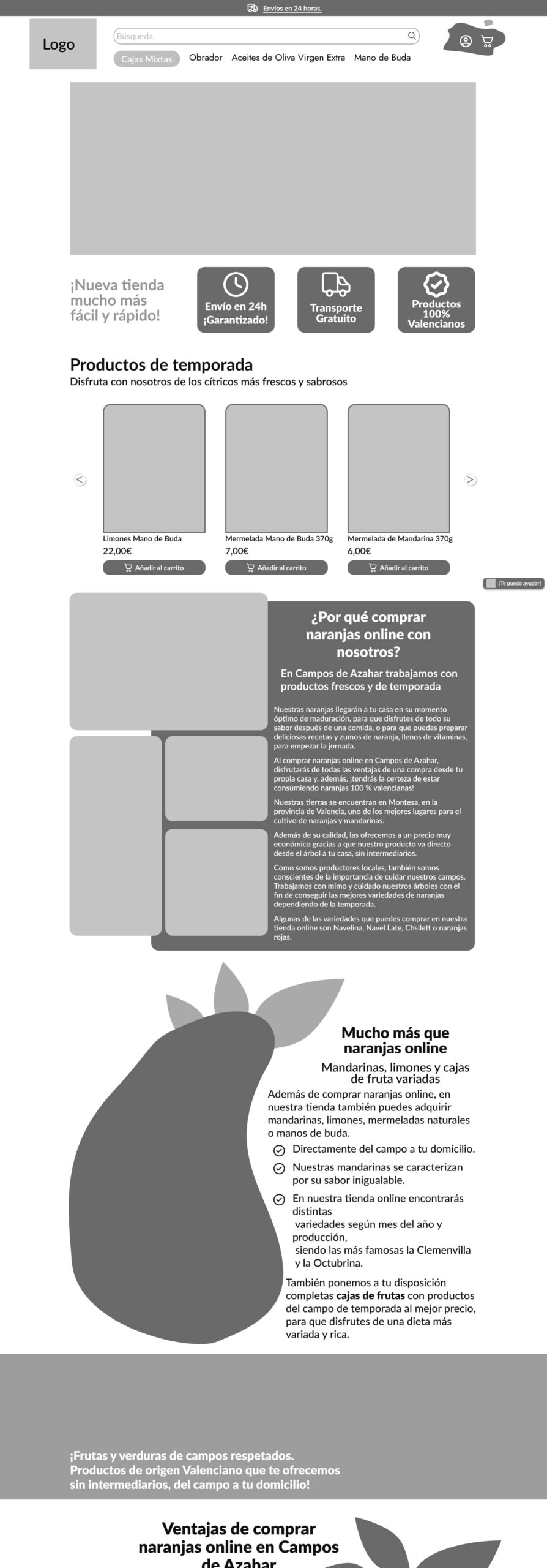
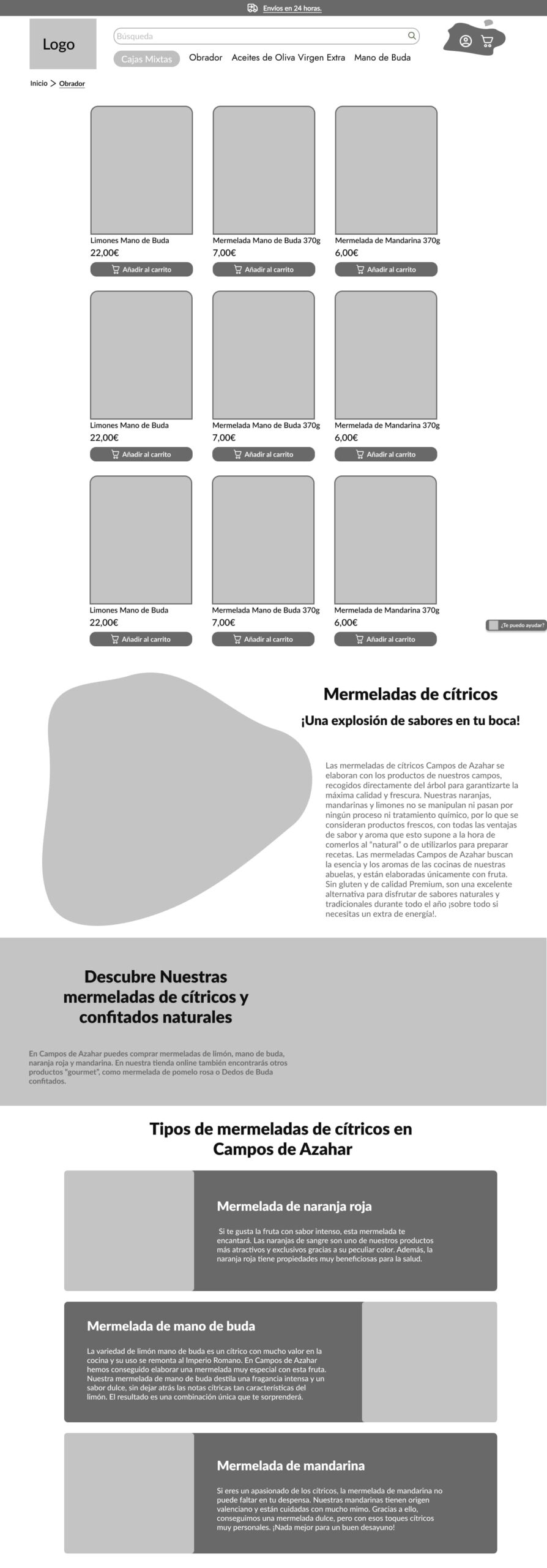
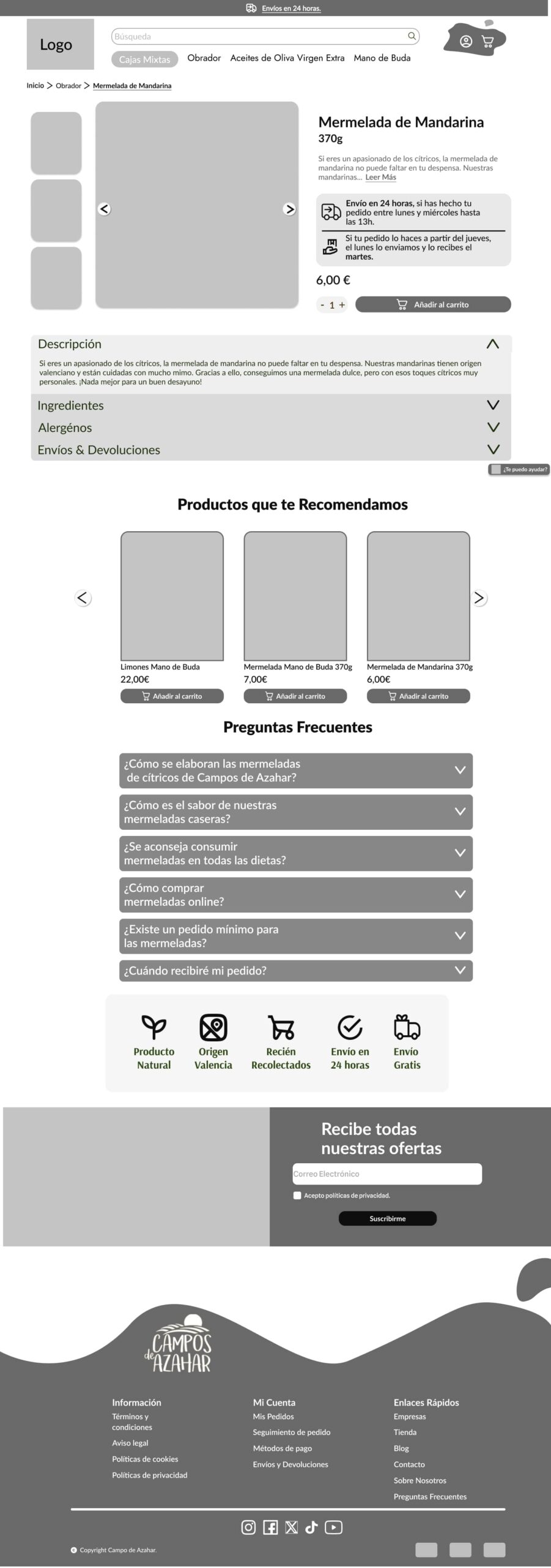
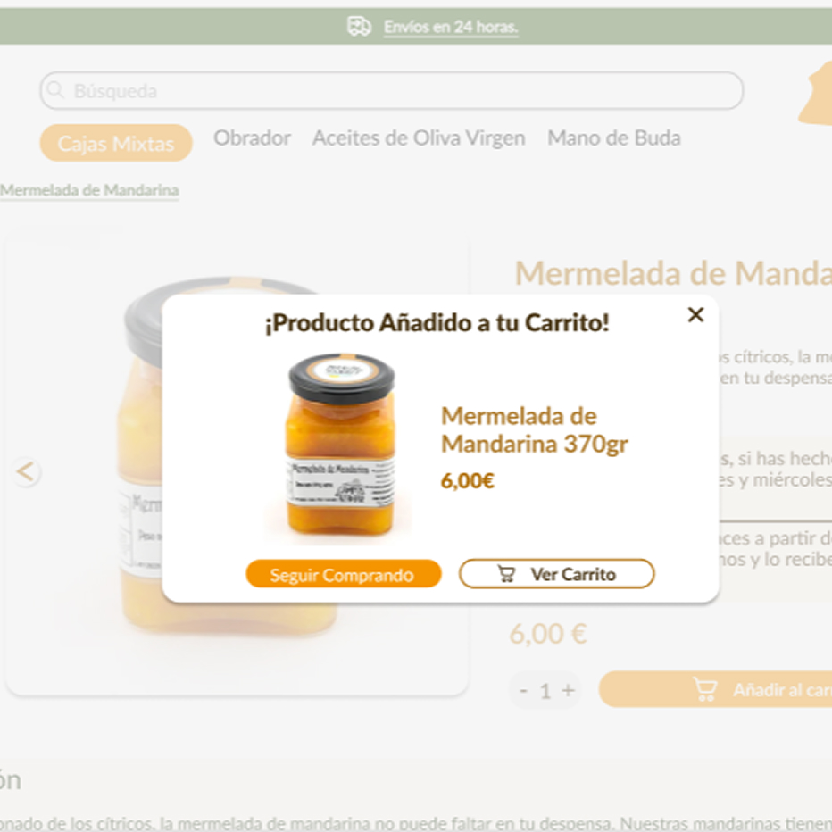
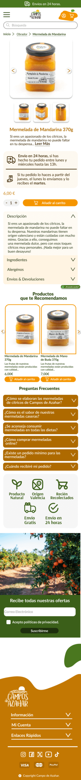
A more complete product detail page was created, with benefits and visual highlights.
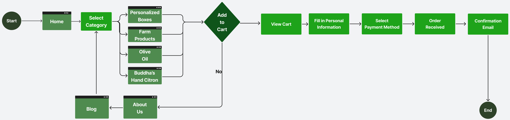
The checkout flow was optimized with clearer steps and a more visible CTA to reduce abandonment.
Sitemap
User Flow
Wireframe
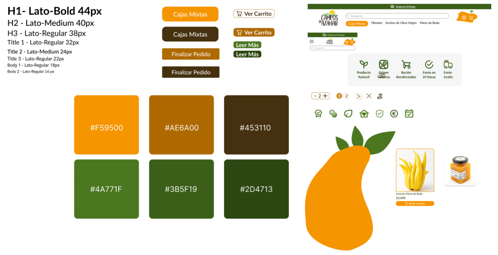
UI Kit
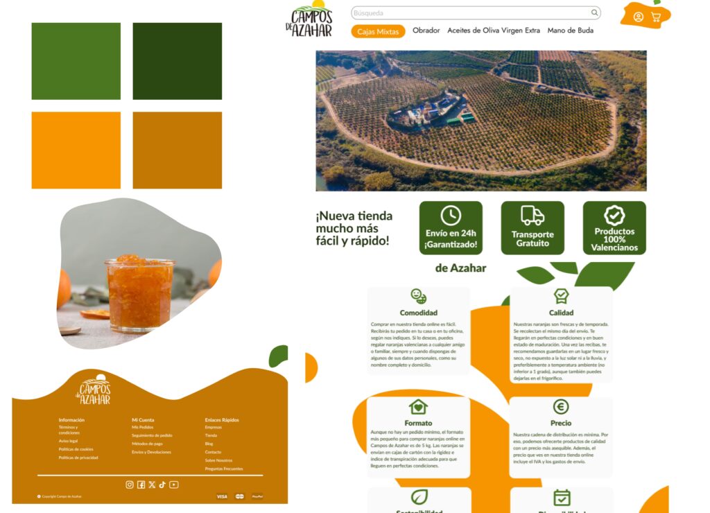
Look & Feel
Mobile UI
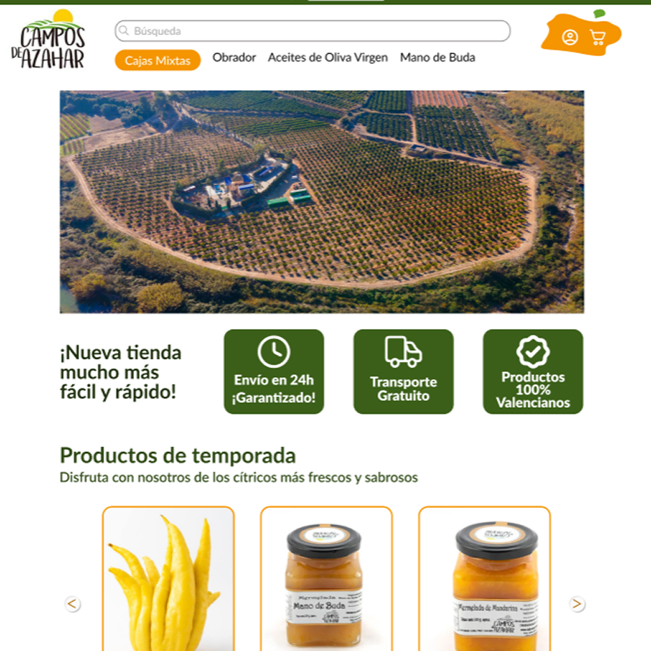
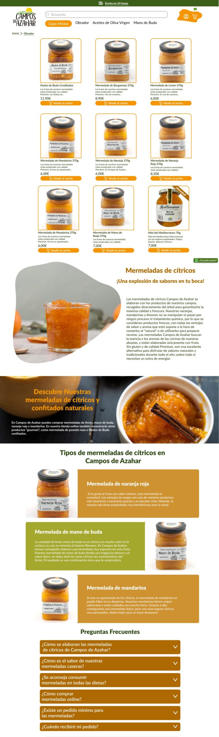
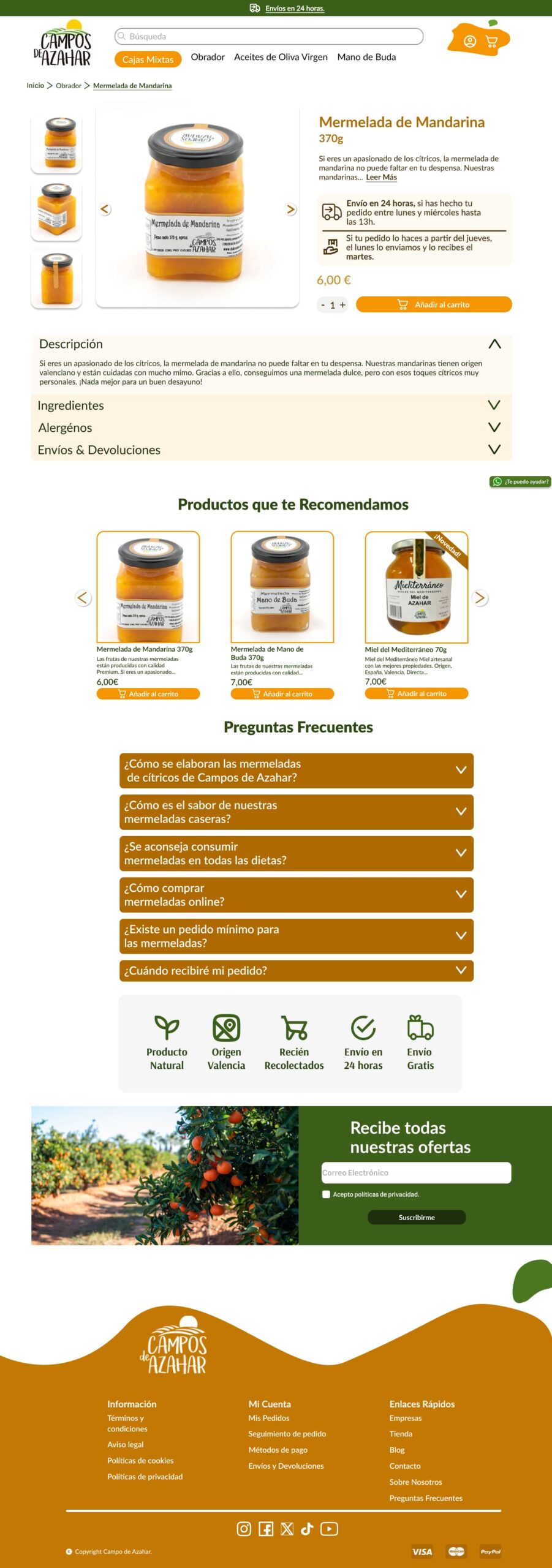
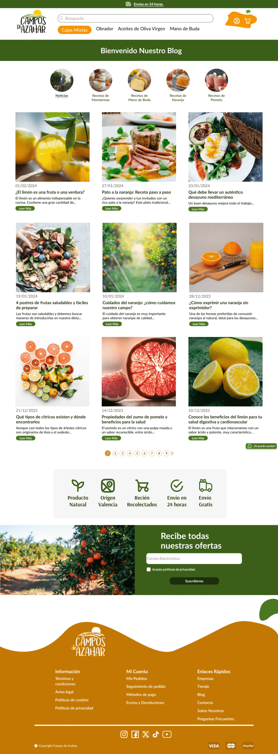
Desktop UI
Outcome
The new design successfully conveyed the brand’s handcrafted identity and improved catalog exploration, creating a clearer and more engaging experience that increased user satisfaction.