The design of a landing page to present and promote an advanced GPS device for bicycles. The page must effectively explain the benefits and functionalities of the product, motivate users to make a purchase or subscribe to the newsletter.
Problem
There was a need to define a landing page from scratch that could clearly and directly communicate the value of the device, structure the message in an understandable way, and guide users toward a concrete conversion action. The main challenge was translating a technical product into clear, relevant, and easy-to-understand benefits for the end user.
Objective
To design a conversion-oriented landing page capable of communicating the product’s key benefits in a clear, approachable, and immediate way, optimized with a mobile-first design and structured to guide users toward the main action: purchasing the device.
Insights
Users need to understand within a few seconds what the product does, what it is for, and why it is relevant to them.
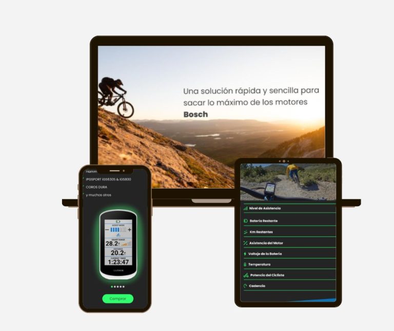
The most influential factors in the purchase decision are clear benefits, visual credibility, and real-life product demonstration.
The landing page must be able to retain users’ attention through a progressive visual narrative, combining short text with real images that inspire the user.
Pain Points
Risk of lack of clarity in the core message if the value proposition is not properly defined from the start.
Need to show real visual evidence of the device being used outdoors to build trust.
Importance of building a fluid structure that allows for quick scanning and naturally leads users to the CTA.
Design decisions
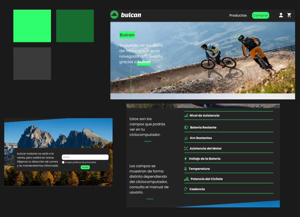
Define a direct hero section that immerses the user in the sport in action, featuring the main benefit, a clear product image, and a visible CTA in the navigation bar.
Build a coherent and optimized visual narrative.
Use a color palette and visual elements associated with adventure, nature, and technology to reinforce the product’s usage context.
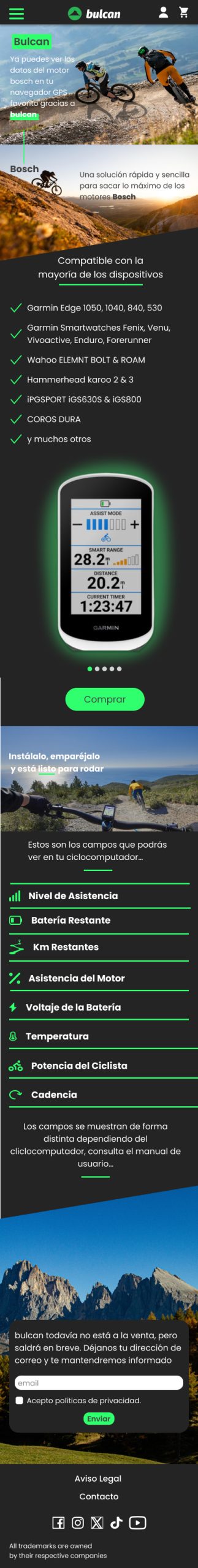
Design the experience with a mobile-first approach, prioritizing efficient scrolling, condensed information, and always-visible CTA.
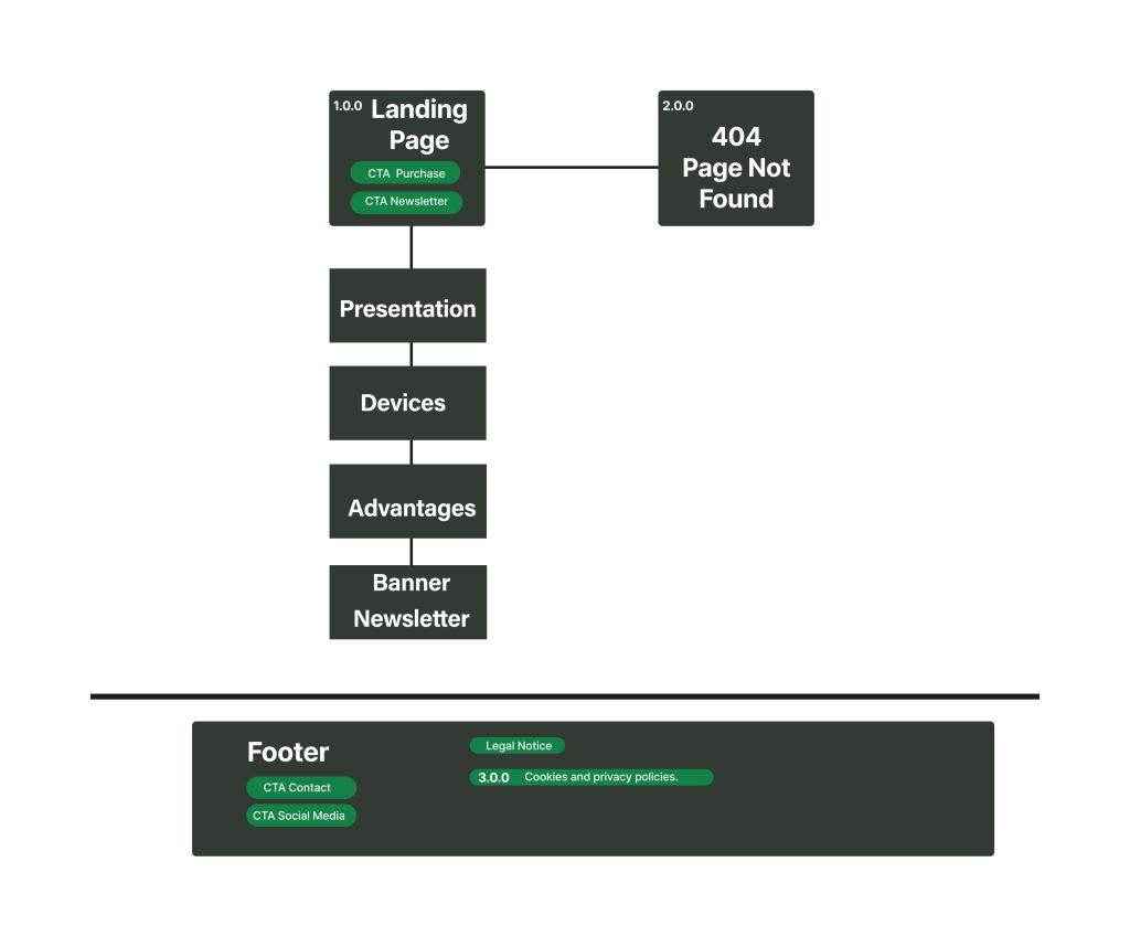
Sitemap
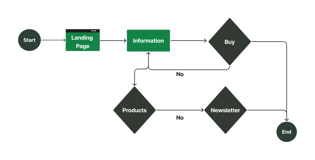
User Flow
Wireframe
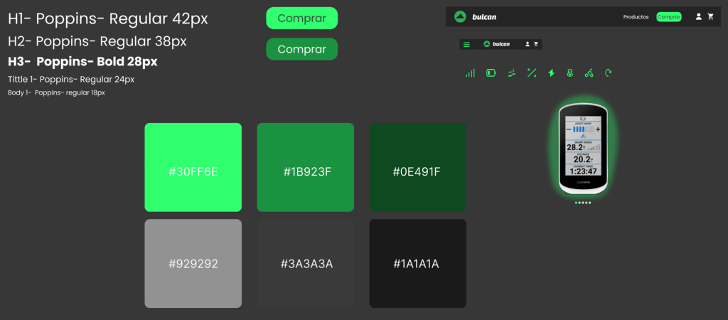
UI Kit
Look & Feel
Mobile UI
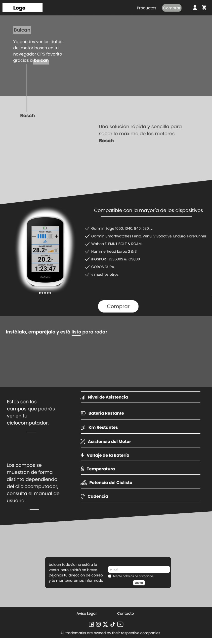
Desktop UI
Outcome
A clear, dynamic, and conversion-oriented landing page was built, effectively communicating the product’s value, presenting information in a hierarchical and engaging way, and naturally guiding users toward purchase.